The last PPC campaign I analysed in the ‘Analyse A Real PPC Campaign’ was from Tegile.com, who had, what can only be described as, a poor campaign with a search advert that did not entice myself much and a landing page with far too much content above the fold (enough to scare most web users away)! It is common around July/August for many people to have summer weddings. So, pretending to be someone invited to a wedding, I thought I would look into this market for analysing a campaign. Therefore, without further ado, here is an analysis of a PPC ieuanthelionshop.co.uk (for which I will refer to as ‘ieuan the lion’ throughout this article).
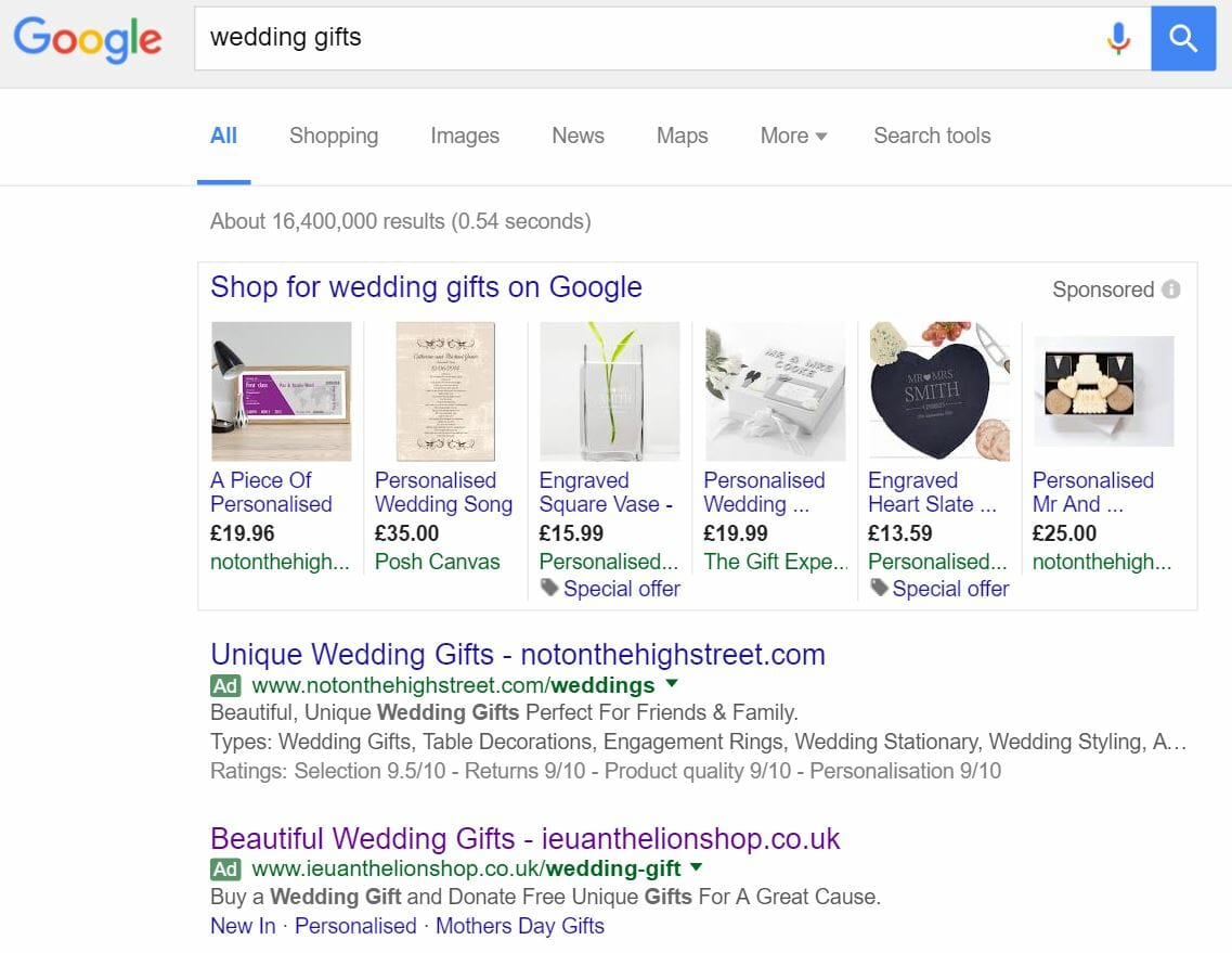
To view ieuan the lion’s PPC search advert, I had to type into Google search UK, ‘wedding gifts’: Straight away, we can see there is a split in the paid section between sponsored shopping results and PPC adverts. Looking at the PPC adverts, we can see Not On The Highstreet have a PPC search advert with a higher CPC (as they are ranked higher). It is also interesting to see how the structure of both titles for search adverts are exactly the same. However, I think, on the whole, Not On The Highstreet has a better advert since their description is more descriptive with more content – it is great that ieuan the lion chose the above structure for their title. But, by doing so, it means they need to make sure they are very descriptive in their description to make up for the vague title. Not On The Highstreet have done this unlike ieuan the lion. However, some of this can be compensated with the use of the site link extension. However, I still feel the description could have had more content.
After clicking on the above advert, I came to the following landing page: This landing page is well designed and has both a few positive and negative points:
- The design is perfect for the type of people that will be landing onto this page. The web user will want to explore the range of wedding gifts ieuan the lion have on offer which they can do so by either:
- Using the expanding navigation menu which expands into many options
- Scroll below the fold of the page (which the web user will be enticed to do so since only parts of the images are above the fold are showing) to visually find the category that they are after.
- Because of the expanding animated navigation menu, the top of the page can be kept relatively clean, enabling more focus to be put on the area where the gifts will be displayed upon clicking on them.
- However, I am not overly keen on the colour choice ieuan the lion have chosen – the orange writing to the middle left is difficult to read on top of the background image.
- As well as this, ieuan the lion have not been clear what they are? Are they a charity? What type of fund are they? If they are a charity, they should advertise it better that profits will go to good causes (as this will give them a USP against other PPC campaigns).
You must be logged in to post a commentLogin