
The last PPC campaign that was analysed in the ‘Analyse A Real PPC Campaign’ series was from Dyson, who had a great example of a campaign with an effective search advert that enticed web users into a click onto a page which illustrated the USPs Dyson can offer to web users if they buy their vacuum cleaners (with patented technology). With Mother’s Day under a week away, we can expect to see adverts starting to appear for those looking to buy their mums gifts. Therefore, without further ado, here is a PPC campaign analysis from one of these campaigns: Happy Days.
To view Happy Days PPC search advert, I had to type into Google search UK, ‘mother’s day gifts’: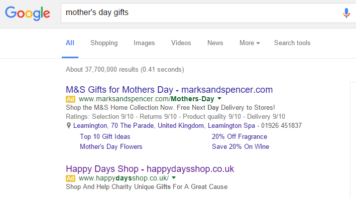 Considering I searched Google to find potential Mother’s Day gifts and gift ideas, I am quite disappointed with the advert Happy Days went for. Yes, it is good to have the brand name and URL in the advert title. However, the advert needs to address what the web user searched for first before promoting the brand name and URL. This is so that the web user can make the link between Mother’s Day gift ideas and Happy Days shop – from just reading the title, it is hard to know exactly what the Happy Days Shop sells.
Moving onto the description, things do not really improve. It is great that Happy Days is for a Charity. However, there are two fundamental problems with the description:
- With the lack of information in the title, the advert could have been recovered if the description went into detail concerning Mother’s Day gifts. The fact it does not does not help the performance of this advert at all.
- Reading the description, it grammatically does not make sense!
Hopefully the landing page will be better. After clicking on the above advert, I came to the following landing page: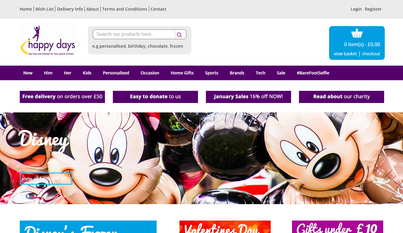 The landing page is an improvement on the search advert. However, it is not perfect with both positive and negative points to it highlighted below:
- + The purple navigation menu used to help web users click to any part of the website is fluid and responsive – this will aid web users find exactly the gift they were searching for.
- + The colour purple is usually associated with quality and wealth so it is a good choice for Happy Days to go for, as it will make their advert and website seem of a higher quality and better value for money than competitors.
- + The center area is filled with a slideshow image, highlighting different areas of the website such as ‘For him’ and ‘For her’. Slideshows are always good on landing pages and will help to generate a healthy CTR too.
- – However, there is some unused space to the right of the search bar and the left of the blue basket icon which could have been utilized more.
- More importantly, the landing page still does not address anywhere what the web user is searching for! At the very minimum the landing page should mention something to do with Mother’s day but the fact it doesn’t will potentially cause the bounce and exit rate of this landing page to be quite high.
You must be logged in to post a commentLogin