The last campaign I analysed in the ‘Analyse A Real PPC Campaign’ series was by Party Delights, who had looked to capitalise on PPC traffic with Halloween coming close by. What we found was that the search advert was different from the competition (which could work in their favour to help them stand out) and they had a well optimised landing page. In this article, I will be looking into a fierce market of competition being the betting industry. Every betting company wants to get people to sign up with them as, for the majority of people, they will only sign up with one ‘booky’ and bet with them. For this reason, I will be analysing a PPC campaign by Coral.
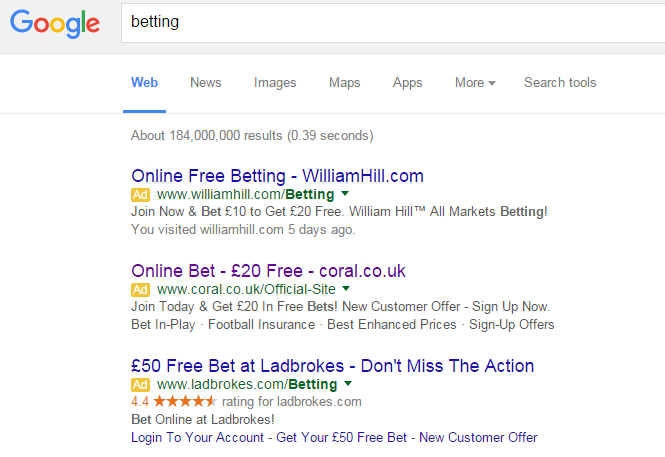
To view Coral’s PPC search advert, I had to type into Google search UK, ‘betting’:
Coral are ranked number five organically making clear one of the reasons why they have made a PPC campaign for such a crucial keyword search. The competition is just so fierce with betting and I am sure Coral would have had to have had a high CPC to get second spot alone. There are many positives to Coral’s advert:
- They have a financial incentive being the £20 free bet. The problem is that so do the other two adverts. Saying this, Coral are the only booky to mention £20 ‘free’ in the advert (and not ‘free bet’). This makes the offer sound better than the others.
- There are many call to actions in the advert. Normally, I would say an advert should have a maximum of two call to actions in the advert (one in the title and one in the description). Coral has three in the search advert which actually works quite well.
However, I feel they should have had one call to action in the title such as ‘Sign up and get £20 free’ – that would have worked much better than their current title.
After clicking on the above advert, I came to the following landing page:
This is one of the best landing pages I have seen in a long while. Here are some of the reasons why:
- It is crystal clear that it is a click through landing page. For this reason, it is perfect at its job in getting the web user to click onto the board the women is holding. It is the centre piece of the landing page made better by the fact the women is holding it too.
- The colours used are bright and go with Coral’s logo colours. The explosion makes the deal seem amazing.
- To make it seem extremely simple and easy for the web user to get the free bet, there are three steps below which outline what the web user has to do to get the cash. This makes it seem very easy to get the free money.
Sometimes in PPC, simplicity often is the best way to succeed: especially with a click through landing page.


You must be logged in to post a commentLogin