The last PPC campaign I analysed in the ‘Analyse A Real PPC Campaign’ series was from Music Notes, who had made a PPC campaign to improve their #3 organic search ranking to compete better with the two competitors above them in Google. As much as the search advert was good, the campaign was let down by a landing which poorly utilized the space above the fold.
Air purifiers are a market that could potentially increase as news increases that China are potentially looking to reduce pollution by banning petrol and diesel cars, whereas the UK have already set out plans forth for this by 2040. With this, here is an analysis of an air purifier company: Blueair.
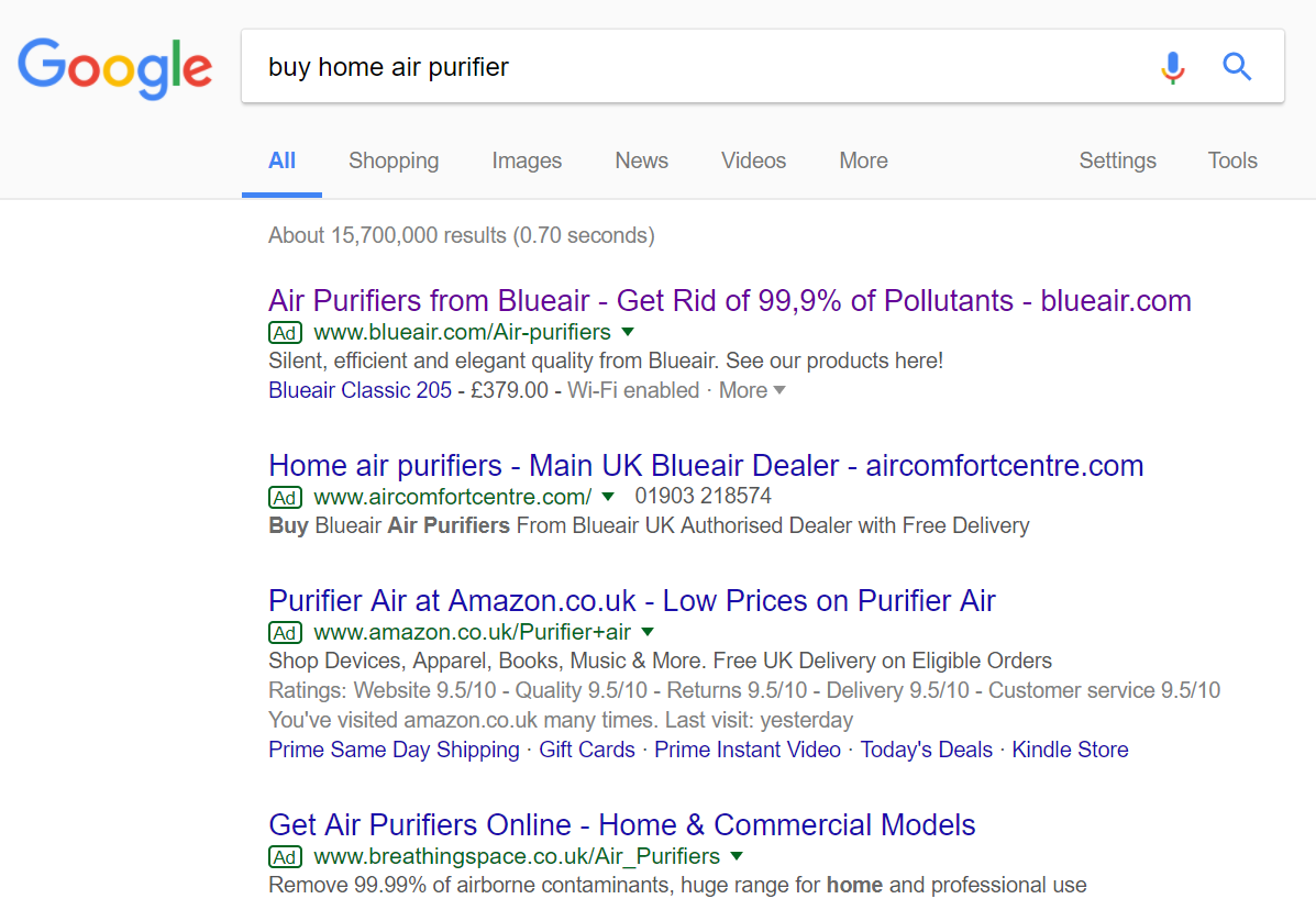
To view Blueair’s PPC search advert, I had to type into Google search UK, ‘buy home air purifier’: What is interesting is the intense competition for such a search phrase, which is understandable since my search phrase directly implies I am likely to convert and buy an air purifier.
The second advert down is quite interesting, considering it is competing not for you to buy an air purifier through them but, specifically, a Blueair air purifier.
Saying this, Blueair have done well to rank #1 in paid search (and kind of had to since other adverts were looking to promote their product – they would have a larger profit margin selling directly from their website rather than a supplier).
Looking at the advert itself, it follows a typical search advert approach:
- A content heavy title – ‘address the search phrase’ – ‘mention a USP of Blueair’ – ‘include the domain name of website to promote brand and direct traffic’
- The description is simple, using the rule of three to entice web users into buying from Blueair, as well as a call to action at the end.
- An elegant and simple site link extension appears, with the price of the site link as well as the option to see more air purifiers from Blueair. This works very well with keeping content to a minimum, putting more emphasis on the title.
After clicking on the above advert, I came to the following landing page: Straight away, the theme of the landing page completely suits the products Blueair are selling. Blue is a very calming and pure colour, as well as the fact the theme has to be blue from the brand name.
The menu at the top of the landing page are just links, keeping the landing page very simple. This will help to move the web user’s attention to the main area of the landing page, where the content is.
What Blueair have done here is clever, using the font size to dictacte what they want you to read first. The largest font is what Blueair wants the web user to read first, followed by the next largest font, and so on. For this reason, Blueair want you to read the large sentences in blue, and do not mind you skipping the smaller black content to view the air purifiers, since this is additional information about the air purifiers.
However, there are no images on this landing page, which would have worked well to have (such as a very clean room with a man/woman looking to breathe easy in it). Apart from this, it is a very good landing page to show the products Blueair have to offer (which appear enticingly just below the fold).
You must be logged in to post a commentLogin