The last article in the ‘Analyse A Real PPC Campaign’ series looked at Wren Living who had both a well designed search advert and landing page. Therefore, from reading the analysis of the furniture store, advertisers will be able to gain many valuable tips they can then apply to their own pay per click advertising campaign. In this article, I will be looking at yet again another different market being the market of pets: in particularly dogs.
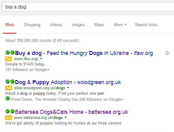
To view a range of adverts about buying a dog, I had to type into Google search UK, ‘buy a dog’:
The campaign I am going to be looking at, from the title of this article, will be Battersea’s. They are a dogs and cats home in the UK which rehouse rescue dogs and are a charitable organisation.
The advert is simplistic which can and cannot work to their advantage. However, in essence, this advert is not the best advert I have seen out there for the following reasons:
- ‘Dogs&Cats’ should be separated by spaces as it is when we visit the landing page.
- The advert doesn’t completely address what the web user searched for. If she/he wanted to adopt a dog, they would have searched for ‘adopt a rescue dog’ ors something along them lines. This advert needs to accommodate the web users that want to buy a dog of which it doesn’t completely do.
- The advert needs an ad extension being the location extension. The description makes clear there are three centres across the UK that have rescue dogs. Therefore, why doesn’t the advert show the closest one to the web user’s location? Battersea have really missed out on that optimisation aspect.
- There is no call to action in the whole advert. I feel they need something such as ‘Come and visit now’ at the end of the description.
- Talking from experience for someone who has adopted a rescue dog, these centres are not full of puppies like the advert makes it sound like. The ages of the dogs range and are generally old and have been neglected unfortunately. I do not like the way Battersea has given false hope to the web user that they are expecting to get a cute puppy.
After clicking on the above advert, I came to the following landing page:
For an error page, it isn’t the best page for PPC traffic to land onto still. The web user is not interested in the latest news or Facebook or Twitter. The only link they will be interested in is the ‘Dogs’ tab on the top left of the page. For this reason, you could probably call this whole campaign a bit of a fail. Hopefully, you will be able to learn not to do these mistakes with your campaign.


