The last article in the ‘Analyse A Real PPC Campaign’ series looked at BookF1 – a website which sells tickets to Formula One races. What we found from looking at their campaign is that they had a search advert optimised with an ad extension.The landing page was good but had a key area of improvement which I highlighted at the end of the article. I tend to find that I have stuck most to campaigns that are based around technology such as music, digital gadgets and appliances etc. Therefore, I am going to change this up by looking at a completely different market: furniture.
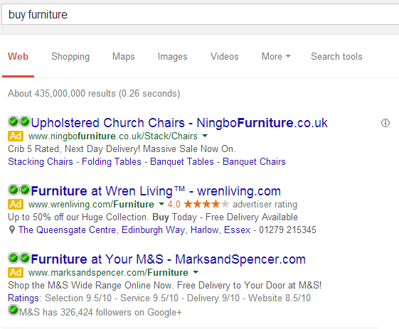
The campaign I am going to be analysing is Wren Living’s. To see their advert, I had to type into Google search UK, ‘buy furniture’:
It is vital for Wren Living to make a campaign because they are not even ranked on the first page of organic results for such a crucial search phrase.
Looking at the advert itself, it is well optimised for a number of reasons:
- They have used the seller rating ad extension which shows off the high rating web users have left the company.
- ‘Wren Living’ has been repeated three times, in total, in the advert. This will help the web user remember the brand name even if they do not click on the advert. From remembering the brand name means they can go to the website later on.
- They have included a figure ‘50%’ and a call to action ‘Buy Today’ in a description, making the advert seem very appealing.
- The final ad extension Wren Living have used is the location extension which highlights to the web user (me) of the nearest store to my location with the store’s phone number: in case I wanted to go to the store instead of shopping online.
After clicking on the following advert, I came to the following landing page:
Again, like the advert, this is a well designed landing page for the following reasons:
- The centre area of the landing page is filled with a colourful and flowing slideshow of the different things Wren Living is offering. This helps inform the web user of lots of information in an easy to read context.
- There is a bouncing animated button in the button left corner with ‘Look here’ on it. Once clicked on, it guides the web user below the fold of the page showing yet more information on sales Wren Living have for different types of furniture. This is a great way to get web users to see information below the fold.
- The top of the page has everything a web user needs: a search bar, area to login or register and a great navigation bar with links to just about every area of the website.
It will not comes as a surprise to see this campaign succeed. Wren Living have paid for traffic they would never be able to get organically and have made a search advert and landing page that will be extremely effective in gaining conversions, be it to buy furniture online or to encourage the web user to visit his or her local store.


You must be logged in to post a commentLogin