The last PPC campaign I analysed in the ‘Analyse A Real PPC Campaign’ series was bet365 who had a good search advert but the landing page had both good and bad points, unfortunately. With it being the end of August already (hasn’t 2015 gone by quickly!), I thought it would be a good idea to look at a PPC campaign that appeared for the back to school event – this is basically when many shops start advertising products/clothing and more around the end of August to prepare children, teenagers and University students for the start of the school year. So, without further ado, the campaign I will be analysing today in this article is Sainsbury’s back to school campaign.
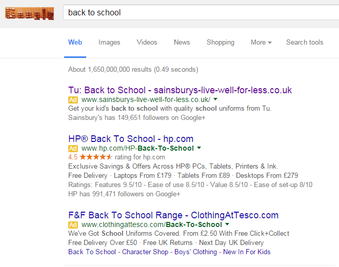
To view Sainsbury’s PPC search advert, I had to type into Google search UK, ‘back to school’: The advert has both good and bad points highlighted below:
- What is ‘Tu’? – To a first time consumer, I do not have a clue what Tu is. With a little research, it is a clothing brand that Sainsbury’s have created (although it does not seem obvious from the PPC search advert – maybe they should have made Tu a little clearer).
- The point of having the URL in the title of the advert is to attract direct traffic. However, who is really going to remember the URL and will be bothered enough to type it into the URL of their web browser to enter the website direct?
- They have used the Google + ad extension to show they are popular on social media and have a following.
- At least the description is a call to action telling parents to get their kids back to school.
After clicking on the above advert, I came to the following landing page: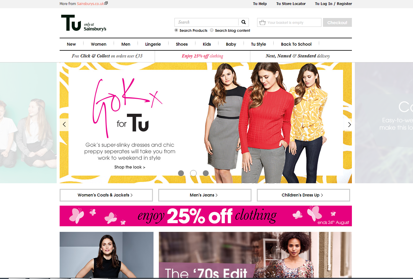 Thankfully, the landing page is a better optimised than the search advert that came before it:
- Tu is made much clearer to be a clothing brand by Sainsbury’s on the landing page removing any confusion the web user might have had before.
- The navigation menu is to the point and clear highlighting what Sainsbury’s has up for offer in clothing.
- The landing page is full of images to be clicked on making it an effective click through landing page – by minimising the content on the page makes it easier for web users to digest the information and images so they can click onto the image/link most relevant to them.
However, putting this all aside, there is a major problem with this landing page – it does not follow on from where the search advert left off. By this, the search advert is about back to school and ‘back to school’ is not even mentioned on this landing page at all! A pretty poor show from Sainsbury’s.
Saying this, the main image is on a slideshow which does feature one image about back to school. But, if the web user does not landing onto this page with that image on the slideshow, there is a good chance they will click off as there is nothing about back to school.
You must be logged in to post a commentLogin