The last PPC campaign I analysed in the ‘Analyse A Real PPC Campaign’ series was from OnePlus, advertising the new OnePlus 7 Pro smartphone. It was clear the PPC campaign was well designed on the whole, with an effective and informative search advert, followed up by a product landing page, dominated by images of the phone, accompanied by reasons to buy it through scrolling down the page (with a sticky ‘Buy’ button continually appearing).
An area that has been very popular and will continue to grab the attention of web users, especially the younger generation, is with YouTube. Looking into this, here is an analysis of a PPC campaign advertising YouTube Premium.
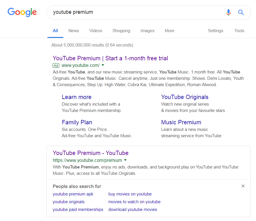
To view YouTube’s (who are owned by Google) PPC search advert, I had to type into Google search UK, ‘youtube premium’: The first thing that should be addressed is ‘what is the reason for this PPC campaign even existing’? This is because the top organic result points to the exact same page that the PPC search advert points to.
There are a few reasons YouTube may have chosen to execute a PPC campaign for their own brand name:
- To inform web users of the offer. It is common for organic results to be very generic and not hold much information. PPC campaigns allow advertisers to choose what information they display, both in the advert itself and the landing page. With this, it is clear YouTube are wanting to make the web user informed that there is a one-month free trial, making YouTube premium appear more enticing to sign up to.
- To display better extension links. Sometimes in organic results, results will have link extensions below them, especially if they are for homepage websites. This is not the case with YouTube Premium. Therefore, the only way YouTube can display site links as an extension is through using the ad extension in PPC.
After clicking on the above advert, I came to the following landing page: Considering that YouTube is a company owned by Google, it should come as no surprise that this is a very well designed landing page, made clear from the following pointers:
- The center attention of the landing page is the product, with the necessary amount of information to entice the web user into learning more about YouTube’s product.
- The conversion for this page is getting the web user to click the ‘TRY IT FREE’ button, which is purposefully made colorful to grab the web user’s attention.
- As a landing page goes, it is very clean and has, what appears, not many links – this pushes the focus continually to the central area of the page.
- If the web user does scroll down, there are images and reasons to join YouTube Premium, further encouraging the web user into a conversion.
Continuing the last bullet point, the only improvement to this landing page would be to, like OnePlus did, have a sticky ‘TRY IT FREE’ button in the top right (or somewhere above the fold). This would allow the web user to convert for YouTube, no matter what part of the landing page they have scrolled to.


You must be logged in to post a commentLogin