The last article to be analysed in the ‘Analyse A Real PPC Campaign’ series was WeBuy who had a created a campaign that was a great example of a bad campaign (the search advert was poorly optimised and the landing page would have been tragic at gaining conversions). It seems that every analysis of PPC campaigns I do are of some sort of products to buy. For this reason, in this article, I will be looking at a different area to just buying products or services: looking for advice on a certain area (which makes me a browser in PPC terms).
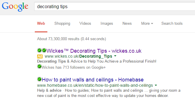
To view Wickes’ PPC search advert, I had to type into Google search UK, ‘decorating tips’:
The interesting area of this campaign is the search phrase. It does not scream ‘I want to buy something’. Instead, it suggests I want to find information about a subject I do not have too much knowledge on. Although some people may think this will not help produce conversions, it will in fact help Wickes because:
- It helps associate the brand Wickes with decorating so if the web user wants to buy anything to do with decorating, they will think about going to Wickes.
- After finding the tips and useful information on the landing page, they may decide to buy some products to help them decorate from Wickes.
It is important to remember that just because a web user does not search for a product or buy something does not necessarily mean they are not going to buy something. All some web users need is a bit of a push into buying something online.
After clicking on the above advert, I came to the following landing page:
- It follows on nicely from where the search advert left off. The web user wanted decorating tips and Wickes have delivered just that on the landing page.
- The choice of colours is brilliant. Purple is a bold colour and signifies wealth and quality. This makes the web user subconsciously think the tips are of quality which will entice them to buying from Wickes in the future.
- There is a great navigation menu at the top so that if the web user was interested in buying products from Wickes, they can do so at a click of a button.
- When I clicked on the search advert, the landing page loaded in under a second. A prompt loading speed helps significantly in reducing the bounce rate of the landing page, enabling more web users to perform a conversion.


