The last PPC campaign I analysed in the ‘Analyse A Real PPC Campaign’ was from Bellroy, who had an interesting search advert with a well-optimised landing page. The search advert was interestng due to the fact that it was the only advert appearing for the search phrase, as well as appearing below Google shopping sponsored results (which included wallets from Bellroy).
The online betting and casino/slot industry is a huge market to capitalise on. However, it is also associated with the most competition as well. With this, here is an analysis of a PPC campaign from Virgin Games.
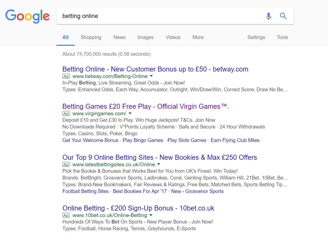
To view Virgin Games PPC search advert, I had to type into Google search UK, ‘betting online’: Straight away, we can see the amount of competition there is for such a crucial search phrase, with the maximum of four adverts appearing in the paid search results. Of these adverts, Virgin Games is second, which provides evidence that the CPC Virgin Games have adopted in their PPC campaign is quite high.
Looking at the advert itself, it contains lots of incentives, both in the title and description, with two call to actions in the top line of the description. From implementing financial incentives into the advert, the web user is more likely to click onto the advert. This concurs with the fact that Virgin Games have also used a power word – these are words in the English Dictionary which encourage more of a response than others. For this advert, the power used is ‘free’.
After clicking on the above advert, I came to the following landing page: This landing page, which is evidently a click through landing page from the large ‘Join Now’, which points the web user to a lead capture page, has both good and bad points to it:
- The navigaiton menu contains links to all of the main areas of Virgin Games’ website for which the web user would likely be interested in. Whilst doing this, the navigation menu is efficient in the space it uses on this landing page.
- But, from allowing the web user to explore the rest of Virgin Games will push the web user away from the lead capture page, which could potentially mean less people sign up.
- The ‘Join Now’ button is large and a different colour to the rest of the landing page to enable it to stand out more. The buttons on click through pages need to be this in order to gain a high CTR, so it is good Virgin Games have done this.
- If the web user was not enticed yet, they would be now due to the fact Virgin Games illustrates the bonuses that the web user would recieve from signing up (with 21 free spins and a £20 bonus from a £10 deposit).
- However, the terms and conditions of the bonus are displayed above the fold, illustrating that there is, in fact, a x4 wagering requirement in order to convert the bonus to cash. This could put some web users off. Legally, Virgin Games would have to include this information on the landing page. However, I feel they could have put it below the fold of the page rather than above it, to make the landing page, above the fold, cleaner in how it looks.


You must be logged in to post a commentLogin