The last PPC campaign I analysed in the ‘Analyse A Real PPC Campaign’ series was from Vegas Paradise, an online casino, who had a very well designed PPC campaign in general. The only negative point was the fact that some of the information in the search advert that was present to entice the web user into a click/conversion was not present on the landing page (being about the web user getting free spins when signing up). It is the end of the summer holidays which, for the majority of theme parks, means the majority of their business has gone! Therefore, it would be interesting to see how a leading theme park in the UK uses PPC at this particular moment in time. Therefore, without further ado, here is an analysis of a PPC campaign by Thorpe Park.
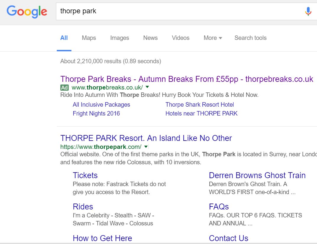
To view Thorpe Park’s PPC search advert, I had to type into Google search UK, ‘thorpe park’:
Organically, Thorpe Park has a great search result with extra links below to the main pages of their website. Therefore, it is clear the main reason Thorpe Park have a PPC campaign for their own brand name is so that they can advertise something other than the website’s homepage: a potential deal to promote holiday breaks away involving Thorpe Park.
Looking at the advert itself, it is a great advert since it includes the following key elements:
- The brand name and URL of Thorpe Park breaks in the title.
- A description that consists of two call to actions.
- A great selection of links for the site link ad extension.
After clicking on the above advert, I came to the following landing page:
As well as this, the general layout of the landing page is very good. The links at the top of the page all go to relevant areas for which the web user could be interested in. At the bottom contains lead captures which will help the web user plan their stay at Thorpe Park and convert for them.
The only drawback to this landing page is the fact that there is quite a lot of content below the fold of the page. However, from first impressions, this looks like the type of landing page that should not have any content below the fold. Therefore, to make sure web users know they can scroll down to be further enticed by more information about Thorpe Park, there should be some sort of small arrow pointing down in one of the bottom corners.


