Although this is part of the ‘Analyse A Real PPC Campaign’ series, this article will only looking at the search adverts and not the landing pages. The last article in the series analysed PlayStation who had a good search advert but, what seemed, a disappointing landing page for the fact that so much of the prime space of the landing page was wasted. In this article, I thought it would be interesting to see the competition for a search phrase, ‘smartphone 2015’. It is about this time each year that all of the large manufacturers release their new smartphones so it would be intriguing to see who has used PPC to try and publicise their new iteration of a smartphone.
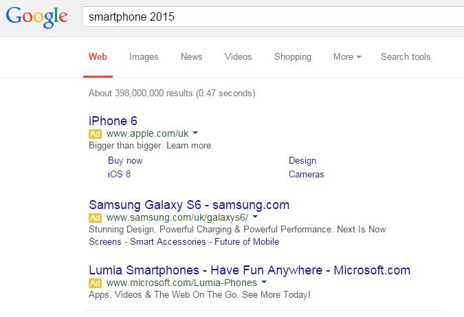
To view the PPC search adverts, I had to type into Google search UK, ‘smartphone 2015’:
- Apple – Apple is known for having very simple and elegant search adverts and they have not disappointed here. Sometimes, in PPC, less is more since it will entice the web user to find out more about things such as ‘Bigger than bigger’. As well as this, the use of the site link extension has enabled Apple to display links to the different areas of the phone. Apple’s vague advert is great in attracting web users and have been placed top of results due to most likely having the highest CPC.
- Samsung – Samsung have gone for a slightly different approach to Apple. They have gone for the vague approach but added more content, so there is even more the web user will want to find out about. I also find it pointless that the advert has ‘samsung.com’ in the title. I understand this is to attract web users that do not click on the advert to directly go to Samsung’s homepage. But, what person is not going to not know Samsung’s homepage before seeing that advert?
- Microsoft – Another interesting approach is Microsoft. Instead of being vague, they are trying to attract the ‘fun’ web users that want a funky and fun phone. This has been achieved through adding ‘Have Fun Anywhere’ as well as the explanation mark at the end of the description. I think it was right to include Microsoft.com in the title (unlike with Samsung) because Microsoft make the phone but the brand is Lumia. Therefore, Microsoft is saying ‘if you want to look more into the Lumia range direct, you can do so through Microsoft’s homepage’.
Ultimately, who has the best search advert? It is a tough call since Microsoft seems to be targeting a different segment of the market whereas Samsung and Apple are going head to head. Therefore, I think Microsoft have done a great job in attracting their segment into a click. For the likes of Apple and Samsung, Samsung has not utilised the characters of their advert and could be minimised down to the likes of Apple if they wanted to. For this reason, due to its simplicity, Apple wins this with Microsoft a close second.


