
Sky Scanner – Analyse A Real PPC Campaign 05 Oct 2017
The last PPC campaign I analysed in the ‘Analyse A Real PPC Campaign’ series was from Tommy Hilfiger, who had a well designed search advert but an extremely poor landing page, simply because it struggled to load and, instead, displayed a corrupted version of their landing page. This would be a big blow to Tommy Hilfiger, reducing their ROI significantly.
With there being a lot of talk about Ryanair having to cancel flights in Europe due to a lack of pilots, it would be interesting to see what PPC campaigns appear for a contextual search phrase looking to buy cheap flights. Therefore, without further ado, here is an analysis of a PPC campaign from Sky Scanner.
To view Sky Scanner’s PPC search advert, I had to type into Google search UK, ‘buy cheaper europe flights’:

Sky Scanner actually ranks organically number one for this search phrase already, which is very good news for them since it is a very good search phrase to rank #1 for. However, it does beg the question why they felt it was necessary to have a PPC campaign ontop of their good SEO:
- To ward off competition? Possibly, although there is no other search advert appearing at the moment.
- To redirect users away from the homepage? Doesn’t seem to be this since the PPC search advert goes to Sky Scanner’s homepage.
- To add more information in the PPC search advert that does not appear in the organic result. It does not seem to be this since the description and title are, near enough, identical in content. However, there is the site link extension which is used. My problem with this is that I do not feel it is enough to make a PPC campaign for, in this example.
After clicking on the above advert, I came to the following landing page:
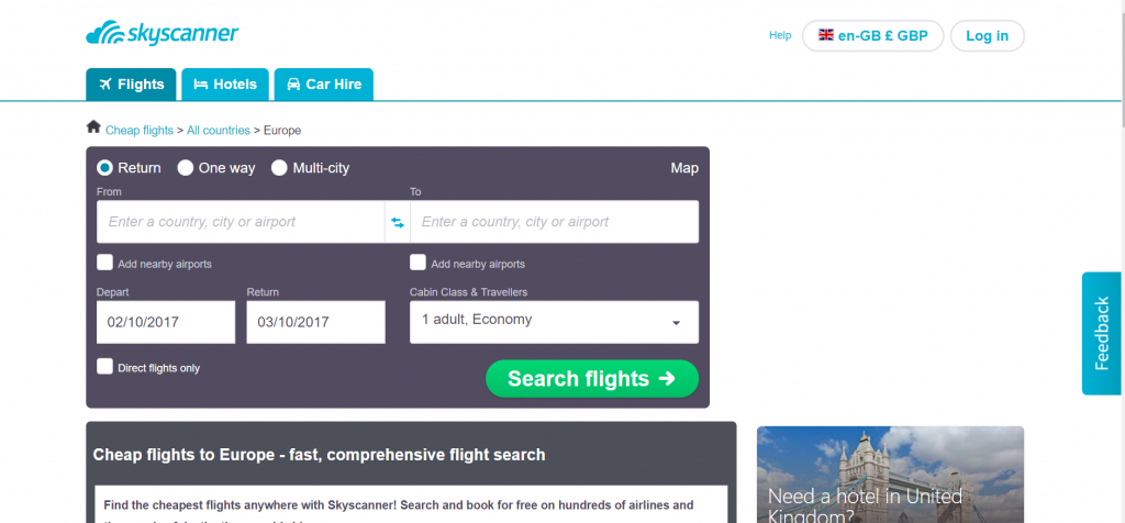
This is the homepage of Sky Scanner’s which has also been used as the landing page for this PPC campaign. Although it is not advisable to use the homepage as the landing page, in this situation, it is for the following reasons:
- The page has a clean minimalist design, which pushes the web user’s focus to the lead capture to the left hand side of the page.
- This homepage is actually a lead capture landing page as well, since there is a form the web user can fill in which will let them see the possible flights they can purchase through Sky Scanner.
- The navigation menu is very very simple at the top, with only three links. Again, Sky Scanner does not want to distract the web user from the form to fill in.
- The only criticism of this landing page is below the fold, where there is a lot of content and links to different locations – this does not really work anywhere as well as the form to fill in. Therefore, it would have worked better if the landing page did not have a below the fold section and, instead, just had the form to fill in.
Will Green
Will created Ask Will Online back in 2010 to help students revise and bloggers make money developing himself into an expert in PPC, blogging SEO, and online marketing. He now runs others websites such as Poem Analysis, Book Analysis, and Ocean Info. You can follow him @willGreeny.
|
Recommended posts
|
