
The last PPC campaign I analysed in the ‘Analyse A Real PPC Campaign’ series was from EasySkinz, who had a well designed search advert that ranked at the top of paid search results. The landing page had a few areas of improvement, mainly utilizing the space the web user will naturally view first: the central area of the landing page. First impressions are everything for web pages, with this rule particularly applicable for PPC landing pages.
An area that is very competitive, due to the reoccurring sales of the service, is with accounting software. With this, here is an analysis of a PPC campaign from Sage.
To view Sage’s PPC search advert, I had to type into Google search UK, ‘accountant software’: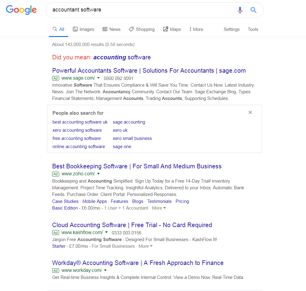 We can see this is a popular search phrase, with the maximum of four adverts appearing. What is interesting is that Google has opted for the ‘People also searched for’ snippet in between the 1st and 2nd results. This makes it even more important to gain the first paid search result, as it helps differentiate the advert further away from the competition and increase the CTR of it.
Looking at the search advert itself, it is, generally, a very good advert. What jumps out for me is the use of ‘Powerful’ at the start of the title. Powerful is an example of a power word. Power words are words in the English dictionary that evoke physical and emotional responses from people. Using them is an effective way to gain a better conversion rate in PPC, just like Sage have done for their search advert. The description is also littered with power words, including:
- Innovative
- Save
- Ensure
- Time
After clicking on the above advert, I came to the following landing page: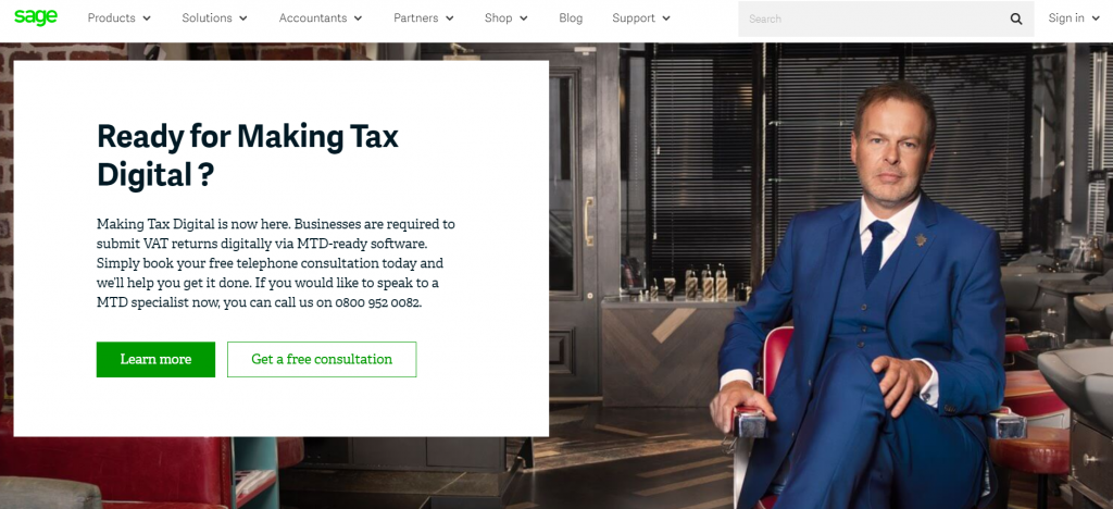 As a landing page goes, this is an effective click through page for the following below reasons:
- The background image is of Peter Jones, a multimillionaire entrepreneurial businessman – to have him on this landing page, endorsing Sage will help bring lots of confidence to the web user that Sage is a great company to use for accounting software, if the best entrepreneurs are using them too.
- The navigation menu expands upon hovering, allowing many options to appear. What’s great is that the menu is non-obtrusive, allowing the attention to be on the box to the left.
- Text on landing pages are generally read in terms of how large the font is. This means the eyes of the web user are most likely to follow to the box, to read ‘Ready for Making Tax Digital?’ This is followed by the content below it, and then the click through buttons.
- It’s interesting that there are two click through buttons the web user can click onto: learn more or get a free consultation. What is especially interesting is the fact the color schemes across them are slightly different. When hovering over ‘Learn more’, the color darkens ever so slightly. When hovering over ‘Get a free consultation’, the box changes to the same color scheme as the ‘Learn more’ button – this makes it seem that, out of the two buttons, this is the button that Sage wants the web user to click onto: subtle but effective!