The last PPC campaign I analysed in the ‘Analyse A Real PPC Campaign’ series was from Microsoft who wanted to promote their new range of Nokia smartphones running Windows OS. The problem with the campaign, though, was the fact that the landing page had not been very well optimised at all. Since the landing page can be considered one of, if not the, most important aspect of a PPC campaign, a poor landing page can have devastating consequences to the whole campaign’s success. In this article, I thought I would look into the housing market to see a campaign that pops up for someone looking to buy a house. For this reason, I will be analysing a campaign by quickmovenow.
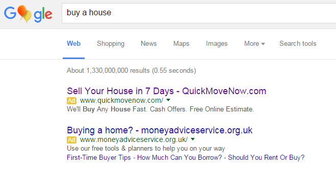
To view quickmovenow’s PPC search advert, I had to type into Google search UK, ‘buy a house’:
Looking at the advert alone, is is a very nice advert. The website’s URL is in the title so web users will remember it, the title and description are two call to actions and there is minimal text so for the web user to find out more, they will have to click onto the advert. It is a shame it is targeting the wrong segment of people on the property ladder though.
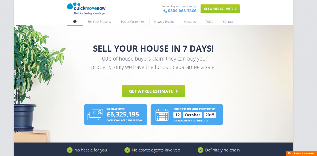
After clicking on the above advert, I came to the following landing page:
- It is clear from the central green button that this is a click through landing page. This landing page will gain a high CTR because the button is the main attraction of the landing page and is nearest to the largest font text (which will inherently be read first by the web user).
- The navigation menu at the top is simplistic…which is good. For such a website, you do not want there to be drop down menus as this is going to give the web user possibly too much choice of links to click onto.


