The last article that was analysed in the ‘Analyse A Real PPC Campaign’ was Wickes, who had a well designed PPC campaign that took advantage of the colour purple on the landing page to add a premium feel to it. With online programs that enable web users to watch TV, movies and more online, I thought it would be right to look at a campaign that can be seen to be a competitor to Netflix. In this article, I am going to be analysis a campaign by the Sony PlayStation Store.
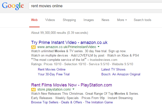
To view Sony PlayStation’s PPC search advert, I had to type into Google search UK, ‘rent movies online’:
Looking at the advert, it addresses the search phrase directly in the title and also includes the URL of the website so that web users can directly go to the website as well as through PPC.
The description, on the other hand, is a little more interesting. Consisting of two lines, Sony have decided to have two sentences for the first line and a set of short phrases for the second. This is effective way to increase CTR since it has filled the search advert with tons of information to win the web user over. As well as this, there are also site link extensions at the bottom of the advert displaying three links to different areas of the website Sony think the web user might be interested in.
After clicking on the above advert, I came to the following landing page:
- The main area of the landing page has a slideshow animation of the films available to rent – directly addressing the web user’s search phrase of wanting to rent movies online.
- There is a great navigation menu with drop down menus too. This will help the web user go to any part of the website.
- The sidebar to the left has a great selection of links from trends to featured links
However, I feel there is room for improvement on this landing page. My main area of frustration is next to the ‘Movies’ title. The theme of this landing page means there is a large space to the right of the title ‘Movies’, which, I feel, is being wasted. Yes, it does make the landing page less cluttered visually. However, this unused space is the main area of the landing page since most web users will look at the centre of any webpage first before anything. Therefore, if I was Sony, I would move the slideshow up to fill in this space and see how that affects the results in PPC.


