The last campaign I analysed in the ‘Analyse A Real PPC Campaign’ series was from Tiffany and Co, who had a very well structured search advert for the holiday season (which made use of ad extensions very well) but had a landing page that had a few areas it could have improved in. Carrying on the Christmas and holiday spirit, I thought it would be interesting to analyse a campaign looking to sell Christmas trees, since towards the end of November/start of December, people will start looking to buy and put up their own Christmas trees. Therefore, without further ado, here is an analysis of a PPC campaign from Pines and Needles.
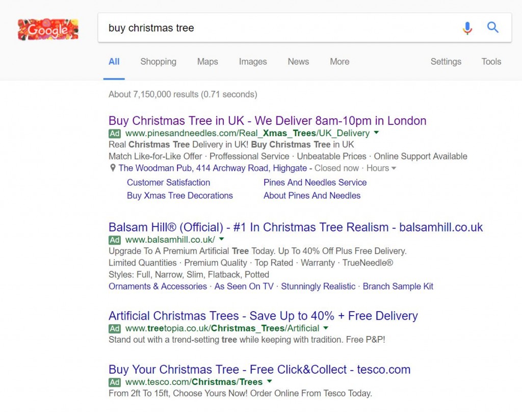
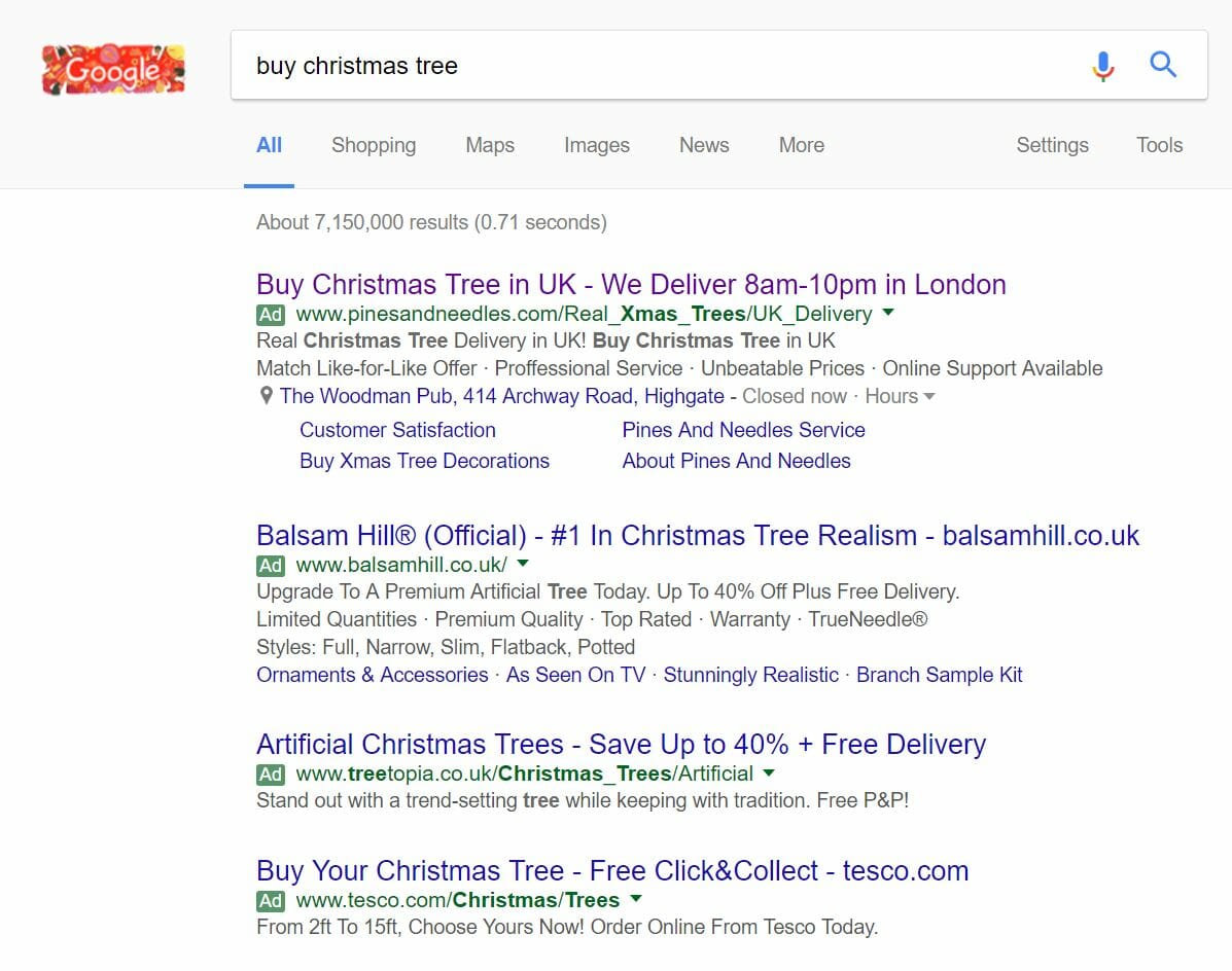
To view Pines and Needles’ PPC search advert, I had to type into Google search UK, ‘buy christmas tree’:
Looking at Pines and Needles PPC search advert, it has the following positive points associated to it:
- It has top spot of paid search results – This will help increase the exposure and CTR of their advert.
- Pines and Needles understand that delivery is important – For many people, they are not going to care specifically where they buy their tree and at what price. When they get it will be important which Pines and Needles have understood by telling web users their delivery times for London.
- The title and description uses the same call to action. This can be effective to drive home to the web user exactly what the website does.
- Two ad extensions are used: the location ad extension and the site link extension. It makes sense to use the location ad extension since if the web user is located nearby to their store, they could pick the tree up themselves instead of waiting for delivery. The site link extensions seem to go off on a bit of a tangent in terms of what links they are showing – maybe this is because Pines and Needles want to differentiate themselves as a great brand for Christmas trees too (although there are better ad extensions to achieve this, such as the ratings extension).
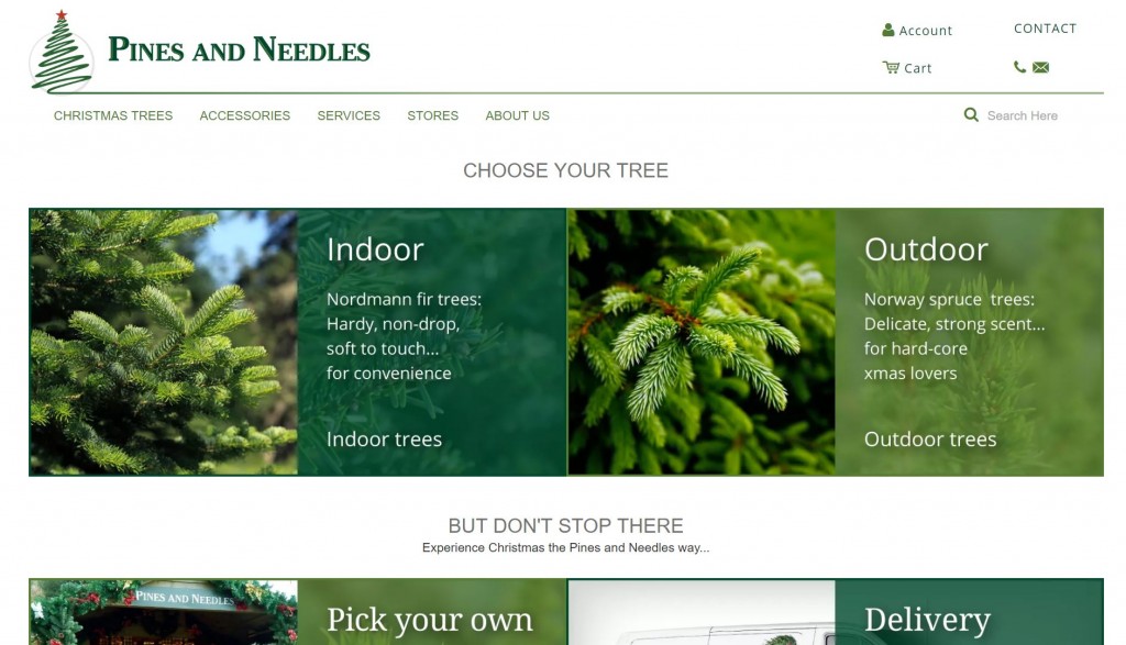
After clicking on the above advert, I came to the following landing page:
Even though there is no holiday theme on the landing page, the Christmas tree itself is a symbol of Christmas. Therefore, they can get away without any hints towards Christmas in their theme. From this, they have kept the landing page very simple and clean, bringing more attention to the images on the page.


