The last PPC campaign I analysed in the ‘Analyse A Real PPC Campaign’ series was from Avanti, who had a good search advert, but had a landing page that was not well optimized for the conversion they want: a lead capture. With a lead capture page, it is important to have the actual lead capture appear above the fold, rather than for the web user to have to find it below, so it is easy for the web user to fill in.
With Christmas right around the corner, now is an extremely profitably time of the year for many businesses, which tends to increase the price for advertising. Looking into the holiday season, here is an analysis of a PPC campaign from Piaget.
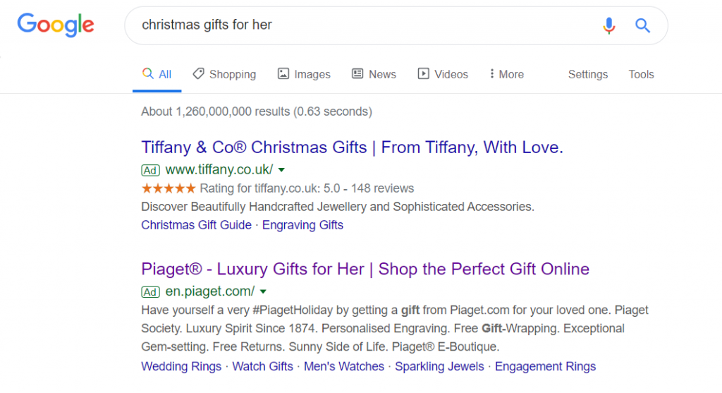
To view Piaget’s PPC search advert, I had to type into Google search UK, ‘christmas gifts for her’: Funnily enough, only two adverts show for this search phrase, which is a little surprisingly considering just how valuable traffic searching for this search phrase could be. Either this suggests the search term is too vague for companies to bid on, or they were put off by thinking it would have too much competition.
Looking at Piaget’s search advert, it has the following good points associated to it:
- By including the (R) copyright symbol made the brand appear more exclusive and official, that Piaget has a name that is worth copying.
- The search title includes the search phrase the web user searched for, whilst the end includes a call to action to encourage web users into a click. The use of words such as ‘Luxury’ and ‘Perfect’ also will entice web users into clicking onto the advert more.
- The description is well designed, by snipping it up into elements of smaller sentences, to fit in as many incentives to shop with Piaget as possible.
The only issue with this search advert is the site link extension, which has some links relating to men’s gifts. This is a bit of a waste of links, considering what the web user searched for.
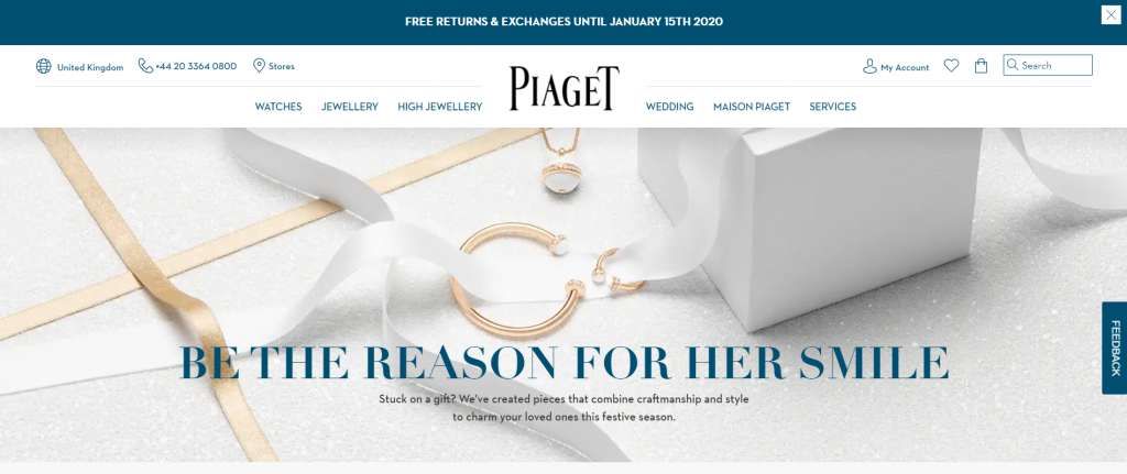
After clicking on the above, I came to the following landing page: Straight away, it is clear that Piaget are trying to appear as a luxury jewellery brand, by including a beautiful picture of jewellery above the fold. This gives off the impression that Piaget have not used a specific landing page, but a generic page on their website, so the web user can browse the website and find the perfect piece of jewellery for the special lady.
This is a little bit of a risk, since using standard pages as landing pages in PPC can be a little inefficient. However, it is okay to do this if:
- The design/theme of the website is aesthetically pleasing.
- The navigation menu is clean and clear to use, enabling the web user to browser the full website
- There is content below the fold that enables the web user to browse too, with links to different areas.
- There are many links to keep the web user on the website.
In the case of Piaget, they tick these points (with lots of links appearing below the fold), making this page a good choice of landing page for their PPC campaign.


