The last PPC campaign I analysed in the ‘Analyse A Real PPC Campaign’ series was from Spotify, who had made a PPC campaign for their own brand name to promote the paid version of their service, which was seen to be a great idea considering their business model only works due to premium subscriptions (and not the free ones).
With January being known as the month to start New Year resolutions, it would be interesting to see a PPC campaign of a gym trying to get people to sign up. Here is an analysis of a PPC campaign from pay as u gym.
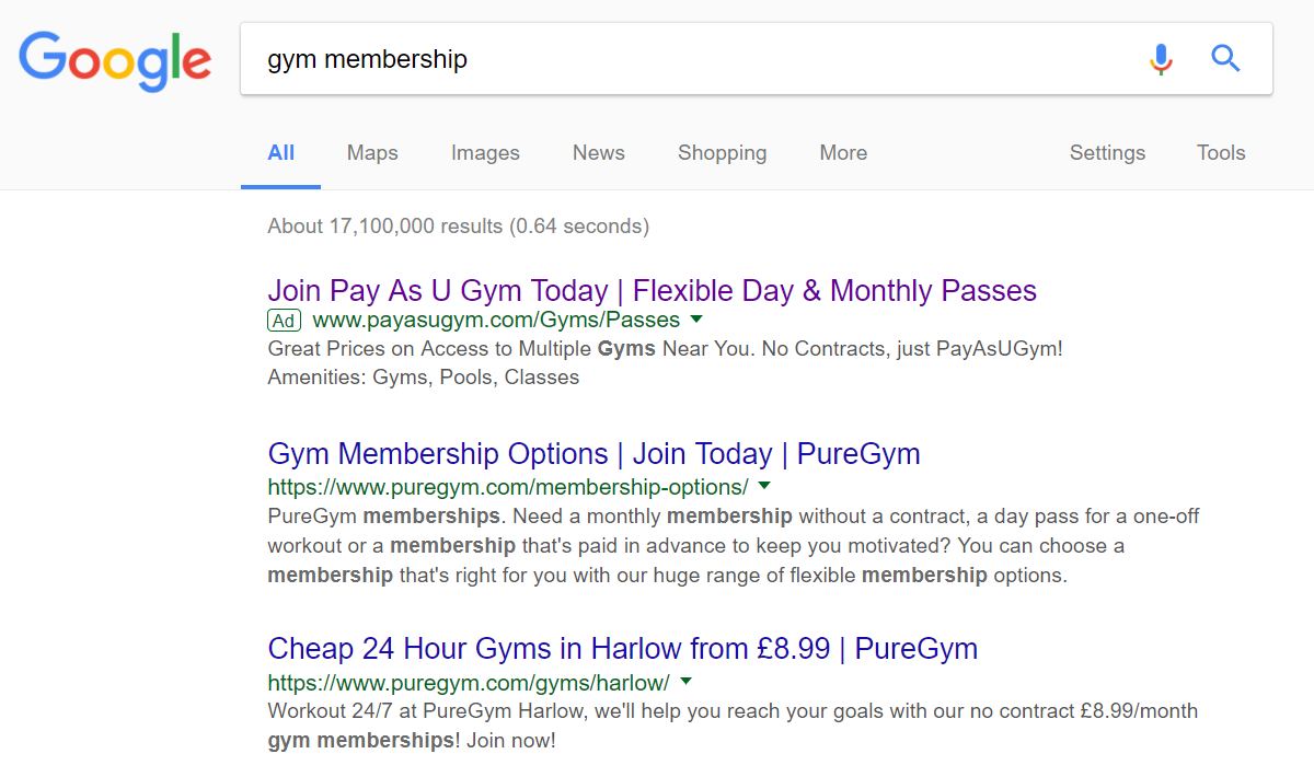
To view pay as u gym’s PPC search advert, I had to type into Google search UK, ‘gym membership’:
It is also interesting that there are no local gyms that are using PPC to target my location to get me to sign up at a local gym. Something such as gym membership works best when it is convenient for the person to get to. It appears many local gyms have not got to grips with PPC yet as this is an area that would really benefit gyms.
With pay as u gym being the only search advert, they can effectively steal traffic away from organic results at an extremely cheap price, since there is zero competition for them to increase their CPC.
Looking at the advert itself, the way the advert works is not by being attractive or having an ad extension that makes it stand out. The attraction to this advert comes with the title, for which the USP of pay as u gym is made clear straight away – a gym membership where you only pay when you go to the gym – if you have a strong enough USP, then you should not need to put extra effort into getting the click – as long as you make it transparent what the USP is, then that should be effective enough.
After clicking on the above advert, I came to the following landing page:
- The background image illustrates the perks of a gym membership on a slideshow. It is dark and un-intrusive, maintaining the web user’s focus with the bottom left of the landing page.
- There is a help sign in the bottom right which expands to a chat, to help the web user use pay as u gym.
- As mentioned already previously, pay as u gym recognize that location is important and has made the landing page focused solely around that. From typing a postcode or location, a list of gyms appear which pay u gym offer ‘pay you gym’ rates.
- The largest text on the landing page is a call to action, encouraging the web user to search for the best gym for their needs.
Overall, this is a great landing page, with both an effective search advert and landing page.


