It’s the last article in the series on optimising landing page. In this article, I will be looking at how advertisers of pay per click advertising can 
What is a Product/Service Page?
A product/service landing page is a page that is part of the main website which holds information on a single product/service. They contain all the information on one product so that you can find out everything you want about that product or service. Some easy examples to look at which are product pages are all of the products on Apple’s website. You will find that every product has a dedicated page which makes it extremely effective in passing over the information about a product to the web user.
What is Your Conversion?
Although this can apply to any type of landing page, you especially need to ask yourself what you are trying to achieve with a product page. The point to this is because your conversion can vary considerably:
- You might just want the web user to find out about your product.
- You might want the web user to buy your product.
- You might want the web user to share your product page on social media websites to gain added exposure.
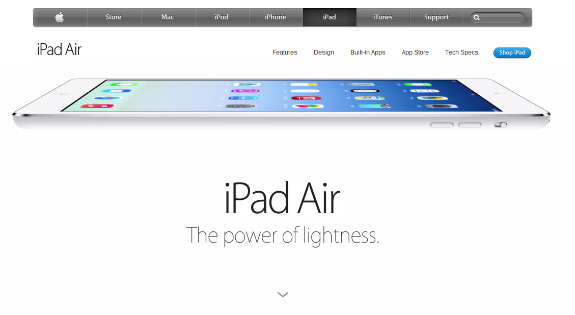
As you can see, the possibilities of your conversion’s definition are endless with a product/service page. For me, I find that a product/service page should be a combination of the above three bullet points plus more. By this, I mean that the page should inform the web user, let them share the page and also buy the product or service. I will give the example of Apple’s product page for one of their products: iPad Air. It has the following conversions:
- It is an infomercial at informing the web user with the specs of the tablet.
- It is a click through page for other areas of Apple’s website and Air’s product page.
- It has the conversion to sell the tablet to the web user.
- It is a microsite in many ways too.
That is the great thing about product/service pages. In some ways, they are a combination of the majority of landing pages out there.
Don’t Include all Information at Once
A big problem with product/service pages is that advertisers tend to put all the information about the product or service above the fold. This means that:
- The web user has no need to scroll down now.
- The page will look cluttered with content which will not be appealing to say the least.
- It will increase the exit rate which is bad for the conversion rate.
For this reason, always remember to spread the content of your product or service down the page so that there is an incentive for the web user to scroll. Again, a great example of that is the Apple iPad Air’s product page, which, to see all the information about the tablet, you have to keep scrolling around 5-6 times.


