The last PPC campaign I analysed in the ‘Analyse A Real PPC Campaign’ series was from Papier, who had a good search advert. The problem with the PPC campaign stemmed from the landing page, which seemed too specifically targeted, preventing some of the paid traffic from wanting to convert, if the products on show were for a narrowed target market than what the PPC search advert was targeting.
Although we are coming to the end of the summer holidays, an area that is always in demand is the flight industry. Looking to book a flight, here is an analysis of a PPC campaign from opodo.
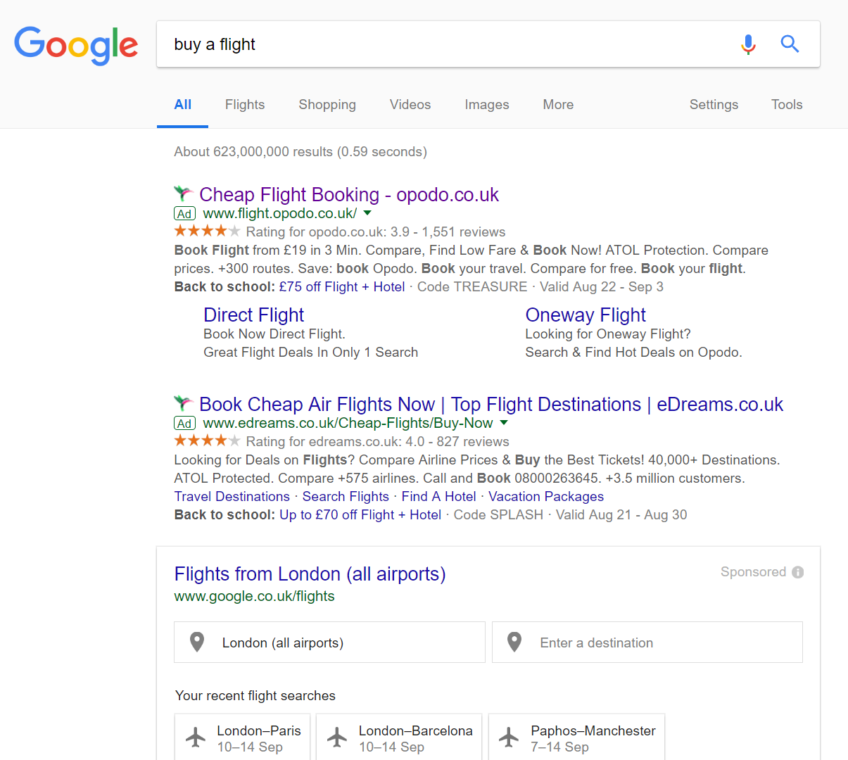
To view opodos’s PPC search advert, I had to type into Google search UK, ‘buy a flight’: Straight away, it is clear that opodo have a healthy quality score, be it by adopting a high CPC of having a relevant and good campaign. Only two of the possible four PPC adverts appear for this search phrase, which is understandable, since the remaining space is taken up with Google’s own sponsored advert. This also makes it difficult for opodo to compete, since it requires a click to get the web user to opodo’s lead capture page, whereas Google has embedded it quite nicely onto the results page – less work for the web user to do = likelier click and conversion.
The use of ad extensions by opodo is effective in making the advert seem clickable. It all adds confidence in booking flights with opodo, whilst there are many call to actions in the description to encourage the web user into a click. The title is also very effective, being very short and to the point, addressing exactly what the web user wants.
After clicking on the above advert, I came to the following landing page: For a website that has the conversion of booking flights, 99% of them are lead capture pages. This is because of the fact the web user needs to put in some necessary information to see the results as to what flights they could book for their needs (where, from and when)? This does mean that the landing page for such a sector are quite similar, with there being a box for the lead capture to happen. What is good and different about opodo’s landing page, though, is just how beautiful it really looks. The background consists of a slideshow of images of different holiday destinations, encouraging the web user to get into the mood of wanting to go abroad (and booking a flight to do so). opodo do not want the web user to scroll below the page, so have made sure it is not possible and have used a nice blend of orange to compliment the landing page.
What is also very good is the fact the lead capture box accommodates for all types of traffic. By this, those looking for flights, flights and hotels, car hire and hotels. This means 100% of the traffic entering this landing page will find it useful in some way.


You must be logged in to post a commentLogin