The last PPC campaign I analysed in the ‘Analyse A Real PPC Campaign’ series was from Disneyland Paris, who had a content heavy search advert, due to the fact of using the full site link extension, whilst the landing page was a lead capture page that used a slideshow animation video to excite the web user with what Disneyland Paris have available.
A company we looked at in the past was Now TV, that had one of the best PPC campaigns I had seen in a while, using the right amount of content and colour to get the conversion they wanted. Looking at a related keyword search phrase, we have managed to find another PPC campaign from the streaming service. Therefore, without further ado, here is another analysis of a PPC campaign from Now TV.
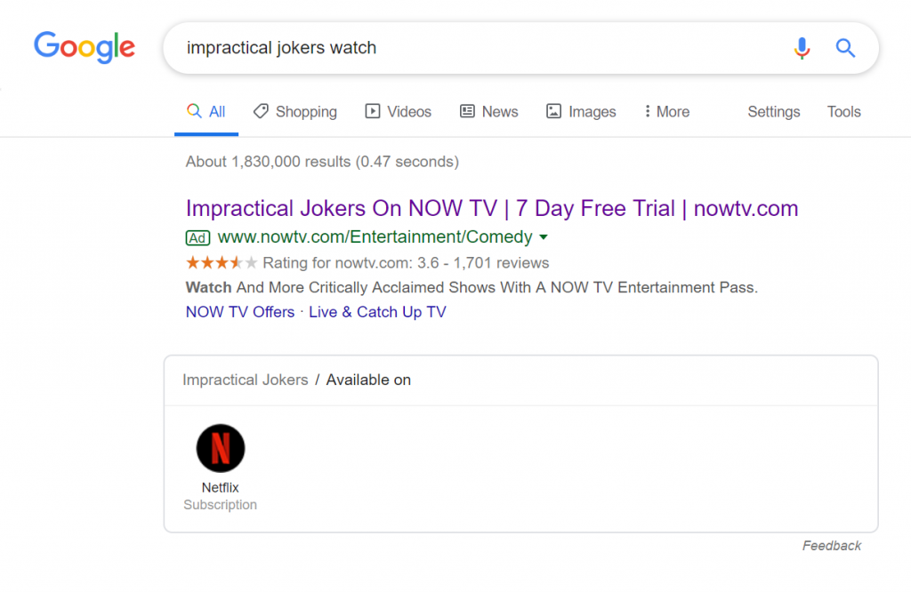
To view Now TV’s PPC search advert, I had to type onto Google search UK, ‘impractical jokers watch’:
Looking at the advert, it has some good areas to it. The search phrase is mentioned at the start of the title, there is a free trial to lure web users in, whilst the description is a call to action to get the web user to click onto the advert. The only problem with this advert is the use of the ratings extension, which should only be used as a further enticement into increasing the web user’s confidence. For me, a rating of 3.6 isn’t high enough to ‘show it off’ in a search advert.
After clicking on the above advert, I came to the following landing page:
- This is a click through landing page from the fact the red box the flows below the fold of the page has a large orange button to ‘Get offer’. Click through landing pages should make crystal clear what they offer the web user and how to obtain it through clicking onto the bottom – it is bad for Now TV that the click through button doesn’t immediately appear above the fold. This makes clear that it is important to make sure the button for a click through page appears above the fold, no matter what type of device views the page.
- The central area of the landing page contains information regarding what the web user searched for: Impractical Jokers. However, we don’t read shows but watch them – it would have been beneficial to include a video/image or animation of a snippet from the show.
- Regardless, the landing page is clean and minimalist, which will help to reduce the exit rate of the page.


