The last PPC campaign I analysed in the ‘Analyse A Real PPC Campaign’ series was from Bulk Powders, who had an advert that lacked exposure levels compared to the competition, namely from the lack of ad extensions used in the search advert. The landing page, though, was much better, that had many elements which would make it a successful click through advert.
With Apple recently releasing the new iPhone 11, many new customers will be looking to purchase their phone, considering just how expensive the new iPhone can be. With this, here is an analysis of a PPC campaign from Mous.
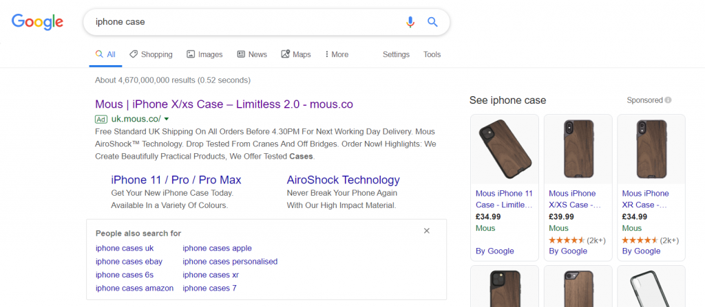
To view Mous’ PPC search advert, I had to type into Google search UK, ‘iphone case’:
What is especially good about the paid search results is 1) they are the only advert showing and 2) the Sponsored shopping results are filled with Mous products. So, as PPC goes, Mous are completely dominating this search phrase, helping to pull in many web users to buying their cases.
Mous chose to target iPhone X/XS web users in the title, since that seemingly is the biggest market to benefit from at the moment. The site link extension helps to bring the 11 users in, allowing the link in the site link extension to be specific to the iPhone 11 users – this is a great way to differentiate the PPC traffic before even reaching the landing page: iPhone 11 users will only be interested in iPhone 11 cases.
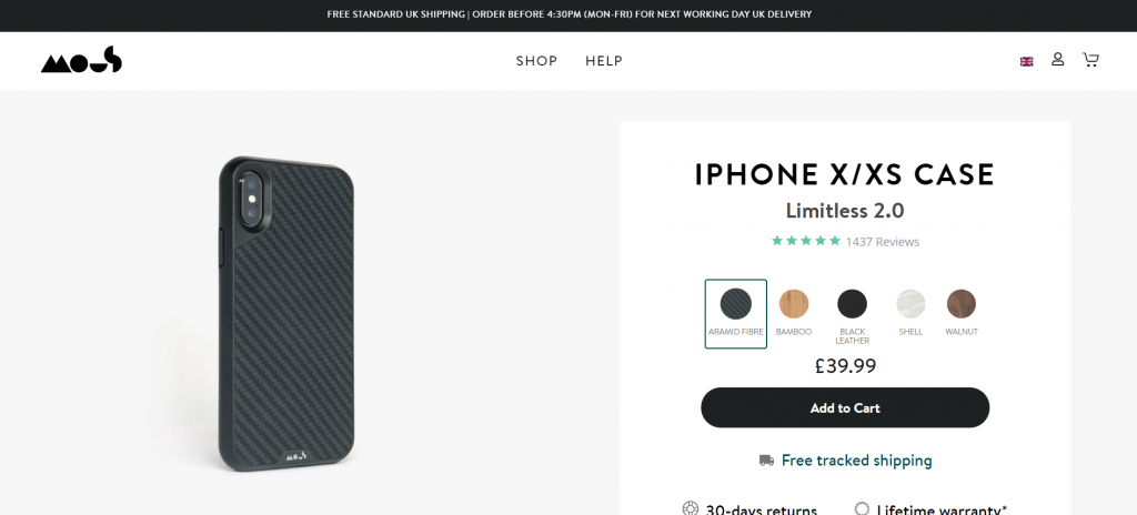
After clicking on the above advert, I came to the following landing page:
There are good points and bad points to this landing page, being a product page, outlined below:
- The theme is clean and clear, which helps to keep things uncluttered, reducing the chance of a high bounce/exit rate.
- Having the only image be of the product helps to focus the web user on the product.
- Mous have decided to include the price above the fold. Considering that this is a premium costing iPhone case, this could be enough to scare some web users away (especially if they didn’t see the prices of the cases in Sponsored shopping results on Google search results). If Mous want to be able to charge that sort of price, it would be a good idea to give web users reasons to purchase the case. At the moment, the only reason to purchase it is based on the image of how it looks.
- Below the fold has the reasons to purchase the phone. Really, this should have been put above the fold, in a easy to read ‘rule of three’ next to the price to provide more enticement into a conversion sale.


