The last PPC campaign I analysed in the ‘Analyse A Real PPC Campaign’ series was from Mous, who had decided to completely dominated PPC search results, including Google shopping results, to gain as much traffic from the search phrase ‘iphone case’. However, the landing page had both good and bad points associated to it, highlighting a few areas of improvement.
One area that has become extremely popular, especially for websites generating revenue from PPC, is with, well, generating revenue from PPC! However, using different techniques and adopting different functionality to achieve this. With this, here is an analysis of a PPC campaign from Media.net.
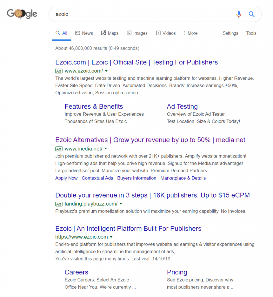
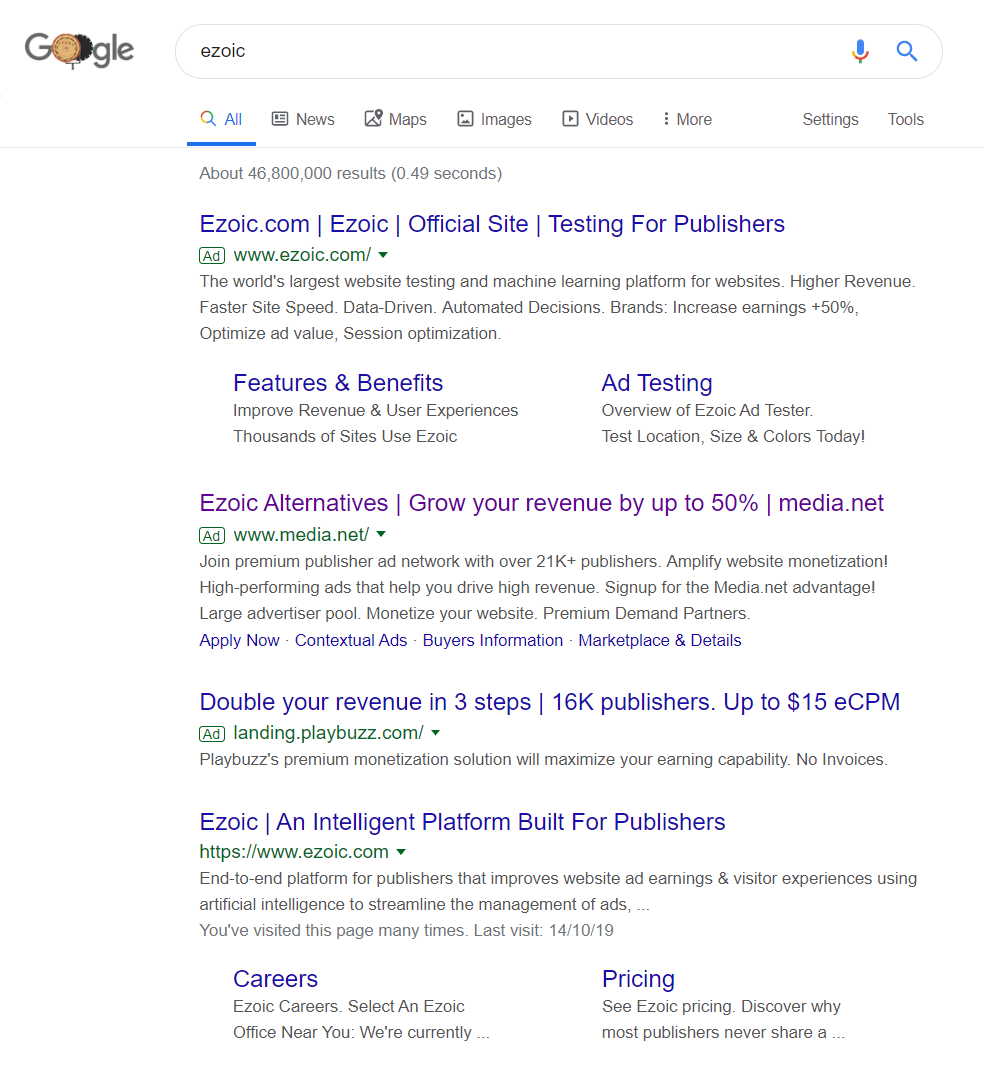
To view Media.net’s PPC search advert, I had to type into Google search UK, ‘ezoic’:
- People searching for Ezoic are likely to be very interested in the competition, such as Media.net
- Ezoic are market leaders in PPC revenue generation, so its a good idea to take traffic from such a brand name
The problem is that Media.net are not the only ones thinking this. PlayBuzz have also a PPC campaign for this brand name, as well as Ezoic themselves ranking 1st, to try and ward off the competition. It is clear the competition is great for this brand name, mainly due to the profit that a conversion can gain.
Media.net have been quite clever with the search title – this is the main area that will help to gain a healthy CTR. Media.net directly references Ezoic at the start of the advert, but references a 50% increase in revenue afterwards. The 50% increase in revenue is as opposed to standard Google Adsense. However, although a little naughty, it appears a little misleading that Media.net can increase revenue by 50% as opposed to Ezoic, from placing the search title the way they have. This could be enough to gain a high CTR for this brand name.
After clicking on the above advert, I came to the following landing page:
- The theme is clean and simple, allowing for bright contrasting colours to be used for the background and click through button.
- The font size is deliberately different for different content, to divert the attention of the web user. Media.net want web users to read the top title first, followed by the lead capture forms, then the click through button, followed by everything else. This is a great ‘flow’ for lead capture pages, since:
- The title gains the web users attention and enticement
- The form states what the web user needs to fill in
- The button completes the conversion
- The information below the button, accompanied by images, is an effective way to further entice web users as to what Media.net a good program to go with to make money from PPC.


