The last PPC campaign I analysed in the ‘Analyse A Real PPC Campaign’ series was from Football Maties, who had targeted with the assumption that those wanting to buy new football boots are a potential market to target to ask for their old football boots to be donated to charity. As much as the targeting and the search advert was good, the whole campaign was let down by a very poor landing page, which had no real way for the web user to convert – this would result in a high bounce and exit rate making the campaign run very inefficiently.
With it being mid-August, many families will be setting for the sky to go on their yearly summer holiday. With this, here is an analysis of a PPC campaign from Kenwood Travel.
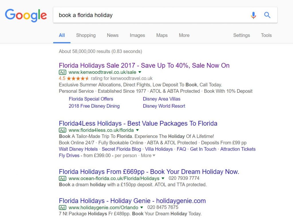
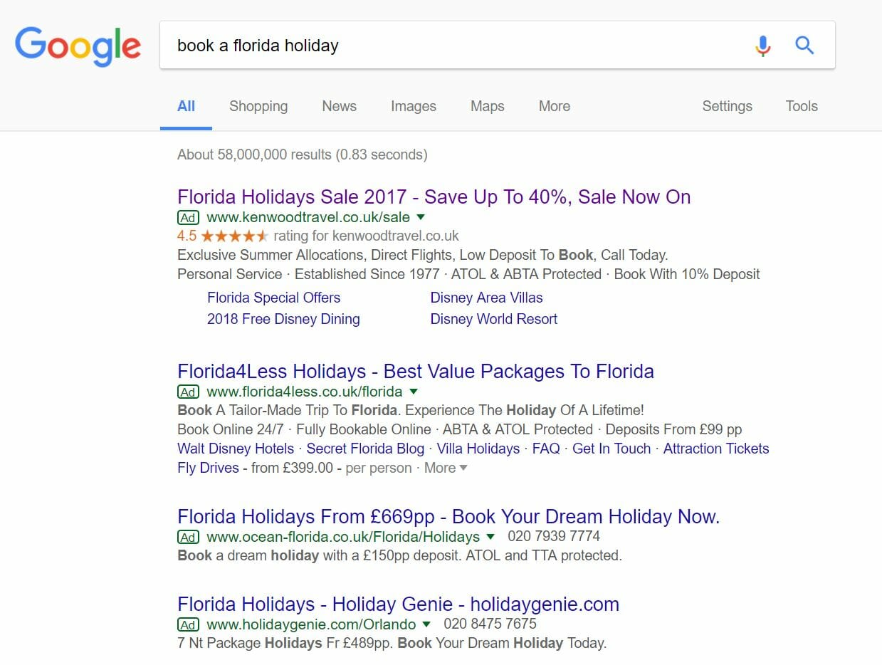
To view Kenwood Travel’s PPC search advert, I had to type into Google search UK, ‘book a floriday holiday’: Of course, such a specific search term will get four adverts appearing since people book holidays all year round and in years advanced.
Kenwood Travel have clearly a very high CPC for this search term, since the conversion can be worth almost tens of thousands of dollars if Kenwood Travel can get a complete package deal sold. For this reason, it is a good idea that they went for the top spot on paid search results.
Looking at the advert itself, Kenwood Travel have been very clear here, by adopting ad extensions to both make Kewood Travel look a reputable company and also increase the size of the advert on the whole, increasing the exposure the advert gets – this also has the potential to push the bottom advert below the fold of the web page for some browsers, reducing the competition Kenwood Travel has to compete with above the fold.
The content of the advert is very good too. The title addresses what I searched, includes a discount and the power word ‘sale’ is mentioned a few times too. As well as this, the description contains some good information and is also filled with CTAs. On the whole, this is a good search advert.
After clicking on the above advert, I came to the following landing page: My first impressions of this landing page are not great, mainly because of the, what seems, bland blue theming. For a holiday to Florida, the theme should reflect the holiday, so bright bold colours would have worked better at providing a sense of excitment.
The box to the left makes clear that this is predominantly a lead capture page. However, the main image is a link to ‘Find out more’, making clear that this is also a click through page, depending on what the web user’s interests are:
- If the web user wants a Florida holiday, this is a lead capture page.
- If the web user wants to understand if they would enjoy and want a Floriday holiday, this is a click through landing page.
This is a good technique implemented by Kenwood Travel to account for the main two type of traffic that heads for this landing page. From this, apart from the bland theming, this a good landing page.


You must be logged in to post a commentLogin