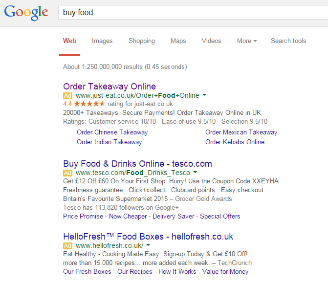
The last article I analysed in the ‘Analyse A Real PPC Campaign’ series was Benadryl, who had, generally, a well optimised and laid out campaign that, from analysing it, would have achieved a healthy conversion rate. In this article, I thought to look into the food industry to see what PPC campaigns appeared for ‘buy food’. At first, I was expecting to see campaigns from the likes of supermarkets and co. But instead, Just Eat ( an online takeaway service) is top of PPC results so let’s analyse their campaign.
To view Just Eat’s PPC search advert, I had to type into Google search UK, ‘buy food’: As I have already mentioned, it was a bit of a surprise to see a takeaway service top spot of paid search results for ‘buy food’. However, it really does make sense. Just Eat have placed themselves top as a lazy alternative to ‘proper’ food. So, they are attempting to lure people into making the lazy choice and ordering a takeaway – clever.
Looking at the search advert, it is great for alot of reasons:
- The title is to the point. I do not even have to read the rest of the advert as the title states exactly what the whole campaign is about.
- Just Eat have used some ad extensions being the seller rating extension, site link extension and consumer rating extension. This helps to make the advert seem less stereotypical of a search advert – the content of the ad extensions will also definitely help improve the CTR.
- Just like the title, the URL is customized to make it to the point.
After clicking on the above advert, I came to the following landing page: I like this landing page but, at the same time, do not like it either. I’ll talk you through my thought process:
- As a landing page, it is minimalistic, does not have much content on it and a lead capture page. This is made apparent from the red box that requests you input your postcode so you can see the local takeaway places near where you live.
- However, many websites ask for your location upon entering them. For this reason, it must be possible to make the process of finding local takeaways automated with the permission of gathering location data from the web user? Would this not make this page redundant and probably improve the conversion rate that bit more?
- I like the use of red – red is a colour associated with urgency. So, by using red will make the web user want to get the takeaway as soon as possible.
- The largest text on the page follows the ‘does exactly what it says’ moto, which I like – sometimes, the simplest landing pages are the most effective.


You must be logged in to post a commentLogin