Colors don’t just make for great looking logos and landing pages, they also trigger emotions. There is actually a complete science and study behind what colors make us think different ways and how they can influence conversions and buying habits of customers.
Before we jump into the usage of colors on landing pages, let’s first think about some of the colors that are being used in the world’s most popular logos.
- Starbucks is Green and Black
- McDonalds is Red and Yellow
- Cocacola is Red
- NBA is Red and Blue
- FedEx is Purple and Orange
How do these logos and colors make you feel when you look at them?
Now take a look at the infographic below to see what each of these colors stand for and how they should trigger different emotions. I’ve listed the major ones below as well.
- RED – Exciting, Demands Attention
- ORANGE – Fun, Ambition
- YELLOW – Happiness, Optimism
- GREEN – Growth, Nature
- BLUE – Trust, Loyalty
- VIOLET – Prosperity, Royalty
The Use of Colors on Landing Pages
Now that we covered some of the basics on what colors can do for a brand and the type of emotions they trigger, let’s take a look at some landing pages and their color usage.
Salesforce.com
Something common you will see across professional and business sites is their use of blue and white colors in their design. BLUE represents TRUST and WHITE is CLARITY… two key components when spending money on new services and hiring.
Dating Landing Pages
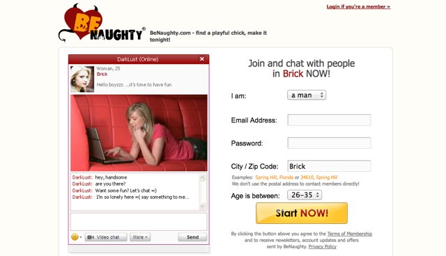
Another great market to look at colors usage on their landing pages is in the dating industry. When looking through different dating offers it’s key to look at the different color usage on “clean” dating sites which are going after the generic and “christian” market, then comparing them to the color usage when you get into the more “risque” and adult type of dating offers.
There are thousands of examples of color usage that you can quickly view by using any of your favorite affiliate networks and running a preview of their landing page, or you can quickly browse through examples using Google Images. The next time you are creating a landing page for an offer, be sure to look at the color usage and see if you are triggering the right emotions for your target audience.


Geoff Todd
September 19, 2013 at 9:53 am
Color can have a big impact on people. I wonder if the feelings and emotions we get from these colors are instinctual or a learned behavior from these popular brands we are all familiar with.
Metz
September 19, 2013 at 10:26 pm
In my opinion, the color is very very important. You must pick the right color/s that suits your landing page. You must have a basis on choosing the most appropriate color.
Pick a color that is good to the eyes.
Anyway, the meanings of the colors are helpful. Good thing that you shared this with us. Thanks! 🙂
I found this post shared on Kingged.com, the Internet marketing social site, and I “kingged” it and left this comment.