The last PPC campaign to be analysed in the ‘Analyse A Real PPC Campaign’ series was by quickmovenow who appeared to have mistargeted their campaign at the wrong segment of people who were moving house (this is a prime example where negative keywords would have made a real impact to the success of this campaign). Over the past few weeks, I have seen many TV adverts and YouTube adverts attempting to persuade me to start buying and selling shares. Judging on the level of competition for such a market, I thought it would be useful to look at a campaign that did just this. For this reason, the PPC campaign I am going to be analysing in this article is from IG.
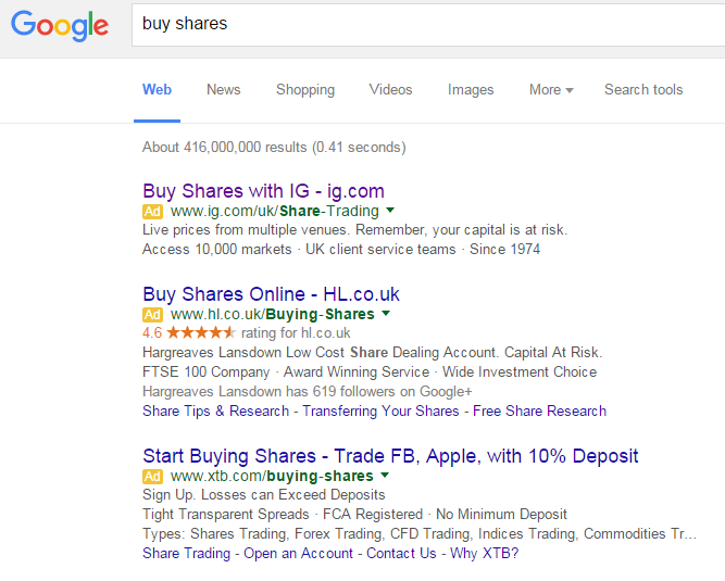
To view IG’s PPC search advert, I had to type into Google search UK, ‘buy shares’:
Looking at the advert itself, it mentions the brand name ‘IG’ three times with twice of these being in the title. This is effective in gaining direct traffic to the website even if the web user does not click on the advert (as they will remember it and possibly go straight to it later on). This brings a good point forward. if you have a premium and easy to remember domain name, mention it many times in the advert so it is engraved into your target market’s memory.
The description is a bit different in style. The bottom line has reasons to use IG while the top line warns the user about their capital being at risk – warnings are an interesting tactic to getting a click that could work well for IG (although, ethically, I do not think people should be scared into clicking on adverts).
After clicking on the above advert, I came to the following landing page:
- The green ‘Create account’ button makes clear this is a click through landing page. Therefore, the objective of this page is to entice the web user further into a conversions (treat this page like a middle man in PPC).
- However, the green button is not that big compared to the rest of the landing page so the CTR of this page could be improved if the button was placed more centrally and larger in size.
- For a click through page, there is far too much going on. I understand that stocks and shares are a hectic place to say the least. However, the aim of this page should be to get the web user to click on the ‘Create account’ button. But, there is not many reasons to go and create an account with IG so IG may find a lot of web users click back onto search results to look for the next best alternative.


