The last PPC campaign I analysed in the ‘Analyse A Real PPC Campaign’ series was from AB Toys and More, who had made a general PPC campaign for fidget spinners. This was a poor targeting choice by AB Toyz and More which did not even mention fidget spinners on the landing page at all.
With the Nintendo Switch seemingly back in stock after being out of stock for quite a while, it would be interesting to see how advertisers have capitalised on a sort-after product becoming available again to sell. With this, here is an an analysis of a PPC campaign from GAME.
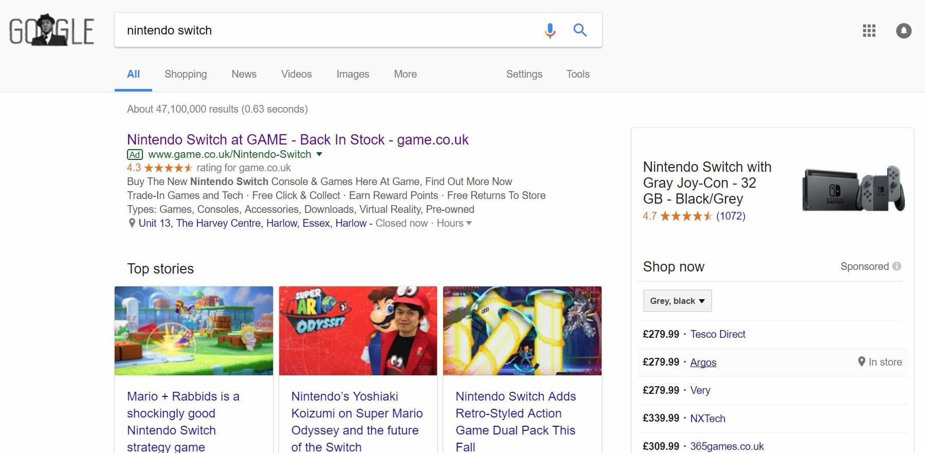
To view GAME’s search advert, I had to type into Google search UK, ‘nintendo switch’:
Straight away, it is clear that there is low competition for the Nintendo Switch, with GAME being the only search advert appearing. This could suggest that the inclusion of Sponsored Shopping results was potentially enough to turn other companies off using PPC to gain extra traffic for potential Nintendo Switch buyers.
Looking at GAME’s advert, it is a good advert for the following reasons:
- The advert is littered with ‘Nintendo Switch’ making the advert appear very relevant to what I searched.
- The URL of GAME appears at the end of the title ot attract direct traffic.
- The title illustrates that the Switch is back in stock, which is important for those wanting to buy it, considering it has been out of stock for months.
- The description does not need to sell the Nintendo Switch since Nintendo have done a pretty good job of that already. Instead, GAME have used the description to share with the web user a little bit more about GAME, which would tempt the web user to purchase the Nintendo Switch through GAME.
- The location ad extension makes clear the nearest GAME store to my location, making it possible to get the Nintendo Switch, and even play on it before I buy it, without a shipping delay.
After clicking on the above advert, I came to the following landing page:
This landing page from GAME is an example of a product/service landing page with shopping results below the fold of the page.
Unfortunately, I feel this landing page has more improvement points than good points, outlined both below:
- There is a bit too much content above the fold for my liking, which could be enough to put people off engaging with the content and the landing page as a whole.
- The navigation menu expands upon hovering, which allows the web user to explore the whole of GAME’s website – this is good.
- The actual area of the web page which is not taken up by fixed content or widgets is quite small, making scrolling the page feel like looking through a keyhole, which does not add up to an enjoyable experience.
- GAME have actually increased the price of the Nintendo Switch from RRP by 32% since the demand is high and supply for the product is low. This is quite cheeky of GAME which have generally built a reputation for selling products to RRP value. Yes, it is in stock. However, you will have to pay 32% higher than RRP value to get the Nintendo Switch.


You must be logged in to post a commentLogin