The last PPC campaign I analysed in the ‘Analyse A Real PPC Campaign’ came from Very, who had a very (no pun intended) good search advert and landing page with the intention to get people to buy the Nintendo Switch console from Very and not competitors at RRP price. However, Very offer a credit service which provides a 10% discount on first order – this was advertised heavily by Very which will attract web users to converting with the company and buying the Switch.
Summer is approaching quickly which means many more people will be taking flights all around the world for leisure and holiday. With this, here is an analysis of a PPC campaign from Expedia.
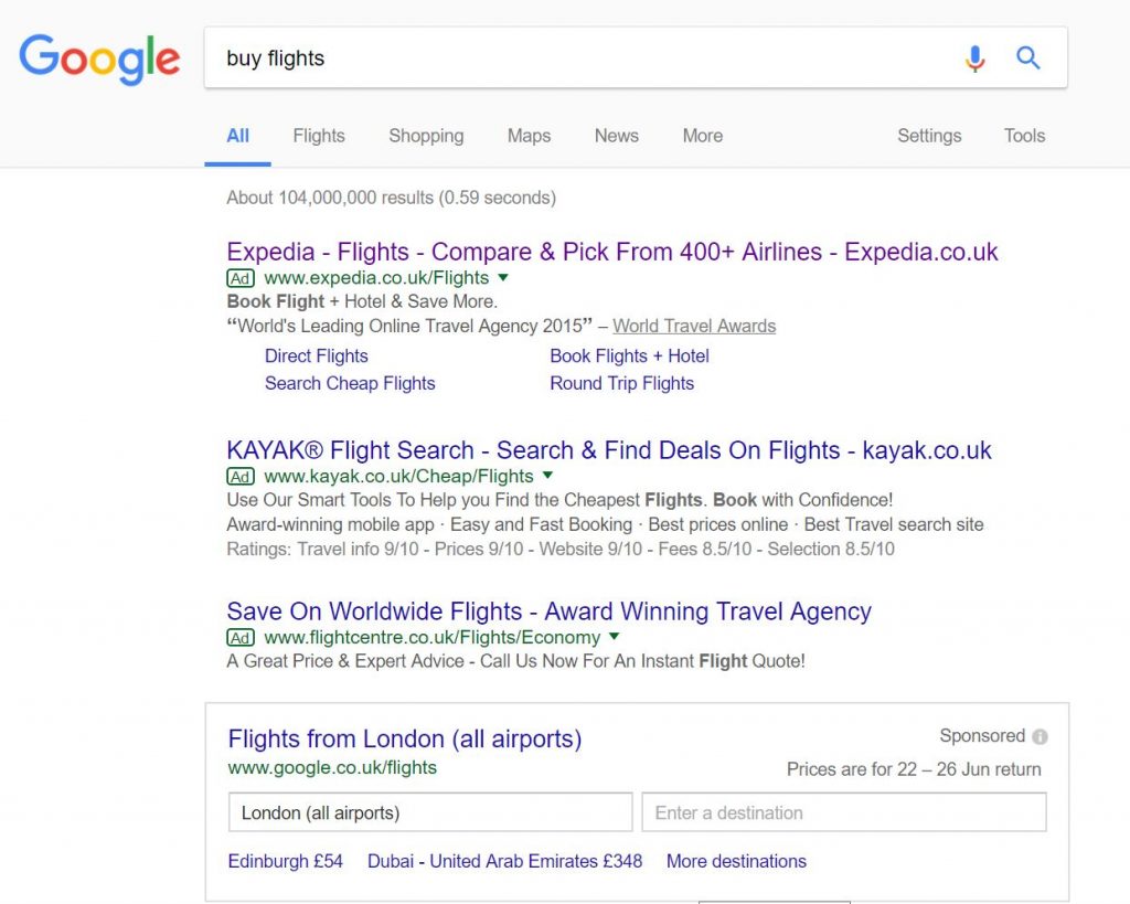
To view Expedia’s PPC search advert, I had to type into Google search UK, ‘buy flights’:
Looking at Expedia’s advert, they have gone for an agressive strategy in terms of CPC to make sure they are ranked number one for paid search results. This is probably a good idea especially due to the fact of Google’s advert being very convertable as opposed to the standard PPC advert Expedia and the other two companies are forced to adopt.
Expedia mention their brand name, URL and the service in the title and use ad extensions to allow the web user to click on more specific links. The desciption is very simple, being a quote from a reviewer. Overall, I would say this is an example of a title-heavy advert, where all of the content is in the title which gains the most exposure, naturally, of all the elements in the advert.
After clicking on the above advert, I came to the following landing page:
There is one distraction, though, being the top banner. However, Expedia is known for being a cost effective solution for flight travel. Therefore, it is a good addition to include a discount the web user could make use of, since this will provide the web user more incentive to buy flights with Expedia.


