The last PPC campaign I analysed in the ‘Analyse A Real PPC Campaign’ series was from Sky Scanner, who had implemented a PPC campaign for a keyword search phrase that they rank for organically number one. After clicking onto the advert, the landing page was very effective in getting the web user to fill in the form to find the flight they want to potentially purchase by keeping things simple.
With Google unveiling their next two flagship phones, it would be interesting to analyse a PPC campaign for such a product. For this reason, here is an analysis of a PPC campaign from EE.
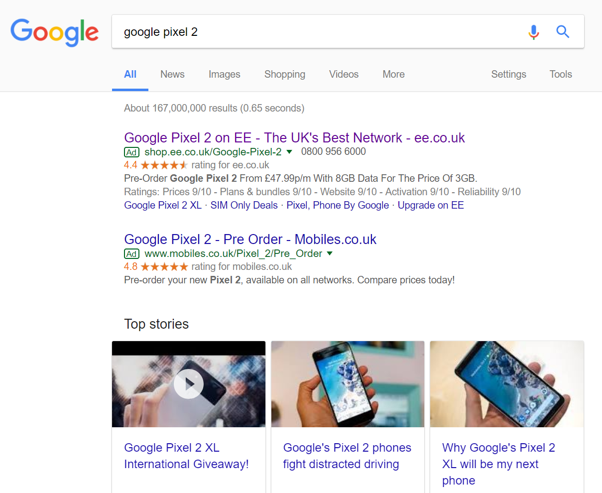
To view EE’s PPC search advert, I had to type into Google search UK, ‘google pixel 2’:
Straight away, Top Stories is dominating the organic search results below paid simply because the Google Pixel 2 phones are ‘hot’ news at the moment. This is quite beneficial to the paid search results since it pushes Google’s organic link to buy direct from Google further down the page, which is going to be the PPC campaign’s main competitor for this search phrase.
Looking at EE’s search advert, it is an advert all about advertising the network rather than the new smartphone. What EE have assumed is that by searching ‘google pixel 2’ the web user is sold by the smartphone and is looking to buy it – what network for it to work on, on the other hand, is still in question.
With this, it is understandable why the title is all about EE being the best network, the description offering a pricing for data/text/minutes bundle, the ratings extension used to quantify EE as a great network to go for and the site link extension to provide the web user more contextual links relating to Google’s phones on EE.
It is an interesting and different approach I have not seen for a PPC campaign. Typically, such a search phrase would bring up comparison websites and normal tech websites that sell the Pixel. However, I like EE’s thinking in using the Pixel to get people lured into going with EE as a network.
After clicking on the above advert, I came to the following landing page:
This is a well designed landing page, full of useful information which would allow the web user plenty of opportunities to explore more about the Google Pixel 2 as well as EE as a network:
- The navigation menu expands upon hovering, allowing the web user to view, pretty much, any part of EE’s website.
- The theming used on the landing page only consists of two colours, which still managed to keep the page looking clean but colorful.
- EE are offering a Google Home Mini with the Pixel 2 on contract, providing another enticement to get people to sign up with EE.
- There is plenty of information about the bundle EE can offer on their network for the Google Pixel 2 phone to the right hand side of the screen. If the web user is not interested in such a ‘Bestselling’ bundle, scrolling below the fold will show a whole range of other bundles the web user can purchase, that appear on a scrolling slideshow. This is a great way to pack lots of information into a small area on a webpage.
Overall, this is a very good landing page.


