The last PPC campaign I analysed in the ‘Analyse A Real PPC Campaign’ series was from Better Help, who had both an effective PPC search advert and landing page, that enabled those needing counselling to feel comfortable into giving Better Help a go with their services – such a PPC campaign was a great way to show how the PPC campaign can be shaped, especially on the state of mind the PPC traffic is likely to be in too (this is extremely important to consider).
Being the most popular month to go on holiday to the likes of Disney, I thought it would be interesting to see a PPC campaign looking into just this. With this, here is an analysis of a PPC campaign from Disneyland Paris.
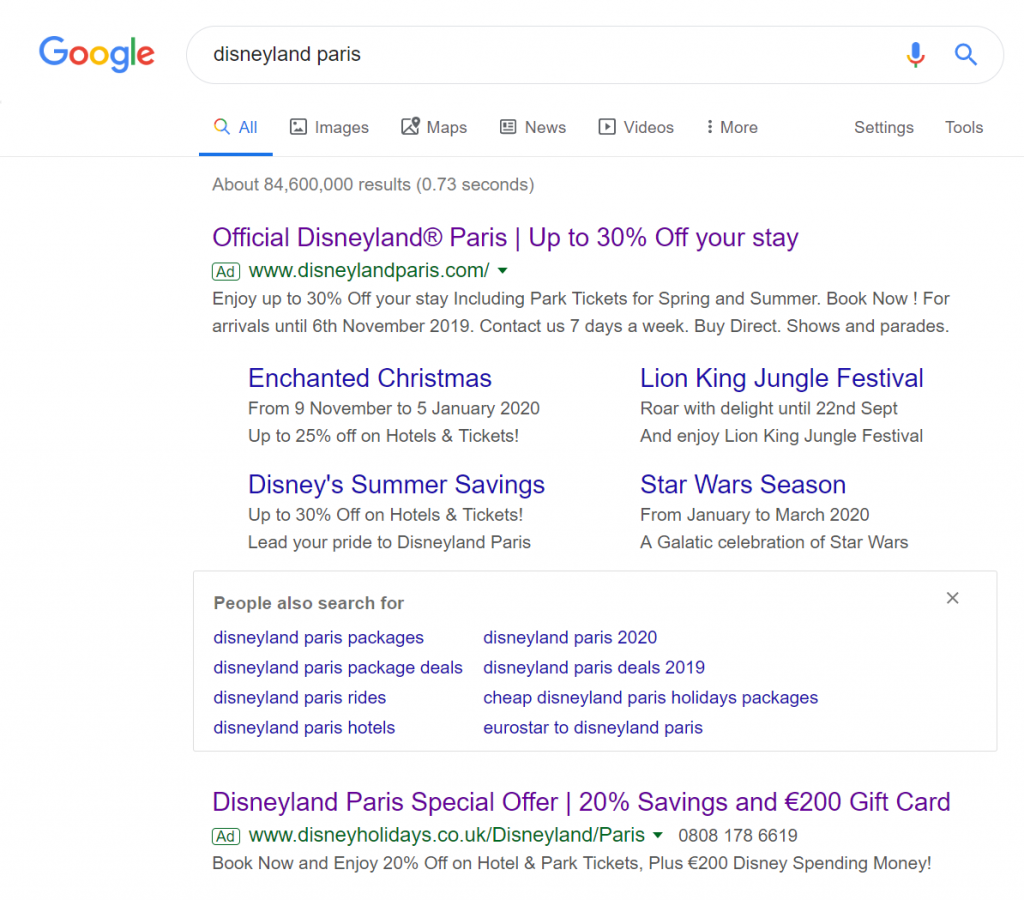
To view Disneyland Paris’ PPC search advert, I had to type into Google search UK, ‘disneyland paris’: The first thing that jumps out from this paid search results is just how big Disneyland Paris’ search advert is. This is due to the use of the site links extension, which is being used in its full capacity of size. This is extremely good idea, considering the fact that the ‘People also search for’ snippet appears below the advert, pushing the bottom two paid results of the four below the fold. This ultimately reduces the competition for gaining clicks, if the web user immediately sees less adverts he can click on above the fold.
Touching on the advert itself:
- The use of ‘Official’, as well as the copyright symbol, will help to bring in a higher CTR.
- There is financial incentive to click onto the advert with there being 30% off.
- A call to action of ‘Book Now !’ is used in the description to evoke the action of a click and conversion from the web user.
Ultimately, this is an extremely good advert, both in terms of the advert itself and the way they have placed themselves in paid search results first, whilst being the biggest advert too.
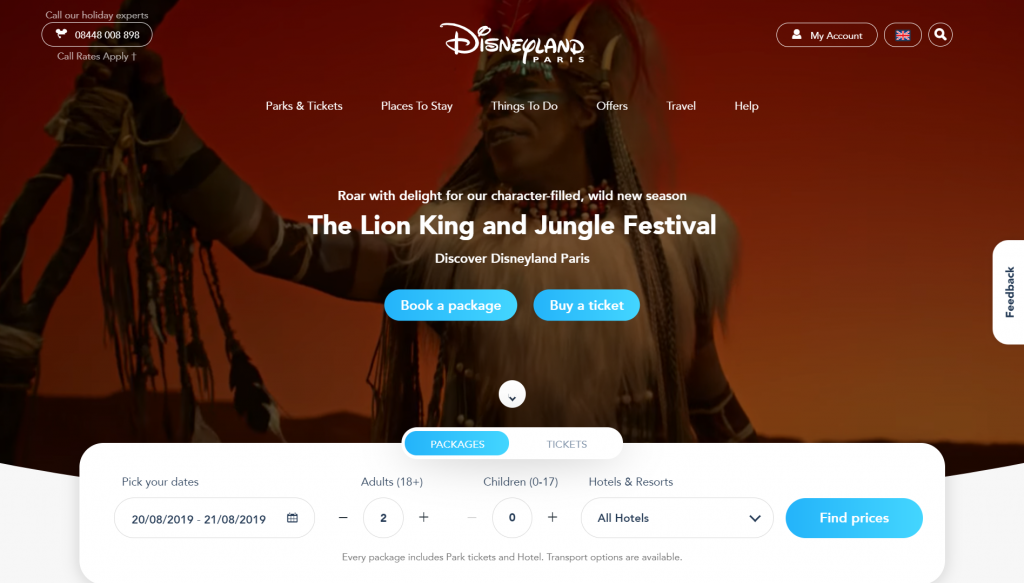
After clicking on the above advert, I came to the following landing page: This is an example of a lead capture landing page, from the use of the form at the bottom, to fill in dates, number of adults/children, and the types of hotels and resorts to find prices for. As a landing page goes, this is a very well designed landing page, with the following noticeable points:
- The whole page is taken back by the beautiful video animation of the Lion King, which Disneyland Paris are clearly promoting on this page. This really entices the web user into exploring more about the new attraction too.
- The navigation menu is absolutely amazing. Without hovering, there are just linked words below the logo, at the top. As soon as you hover, the whole page is changed to a complete navigation menu pop-up – this is a great idea since the video animation of Lion King might make it difficult to read the contents inside the navigation menu.
- Upon scrolling, the lead capture form becomes sticky, making it possible for the web user to convert at any point on the landing page – another way to make it even easier for the web user to find prices, based on the type of holiday they want.


