The last PPC campaign I analysed in the ‘Analyse A Real PPC Campaign’ series was from On the Beach, which had bravely kept their PPC campaign going, amid all flights cancelling and the holiday sector, pretty much, being stuck on pause, whilst the coronavirus outbreak continued. Putting this aside (and forgetting about the pandemic), the PPC campaign was well designed, with a nice use of site link extensions in the search advert, and a blue coloured lead capture page, to encourage web users to get into the spirit of holiday.
One area of the market that seems to be in demand, since many people are social distancing and working from home, comes with the streaming of video content from home. With this, here is an analysis of a PPC campaign from Disney+.
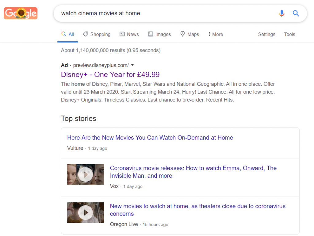
To view Disney+’s PPC search advert, I had to type into Google search UK, ‘watch cinema movies at home’: Disney+ are the only advert showing for this, which is quite strange, considering the amount of people that are now working from home, likely to want to watch something and stay entertained. It helps to Disney’s advantage that the news separates the search advert from organic results, which will, no doubt, increase the CTR of the advert.
Looking at the advert itself, it is interesting how Disney has approached the search advert. They are relying on the brand name to make clear it’s a Disney streaming service for video, with a little more information in the description. It is very interesting that Disney has also decided to stick their pricing structure for their service in the advert, £49.99. This suggests that Disney are quite proud/happy to show off the pricing structure, which makes sense when comparing the pricing per year for Netflix and Amazon.
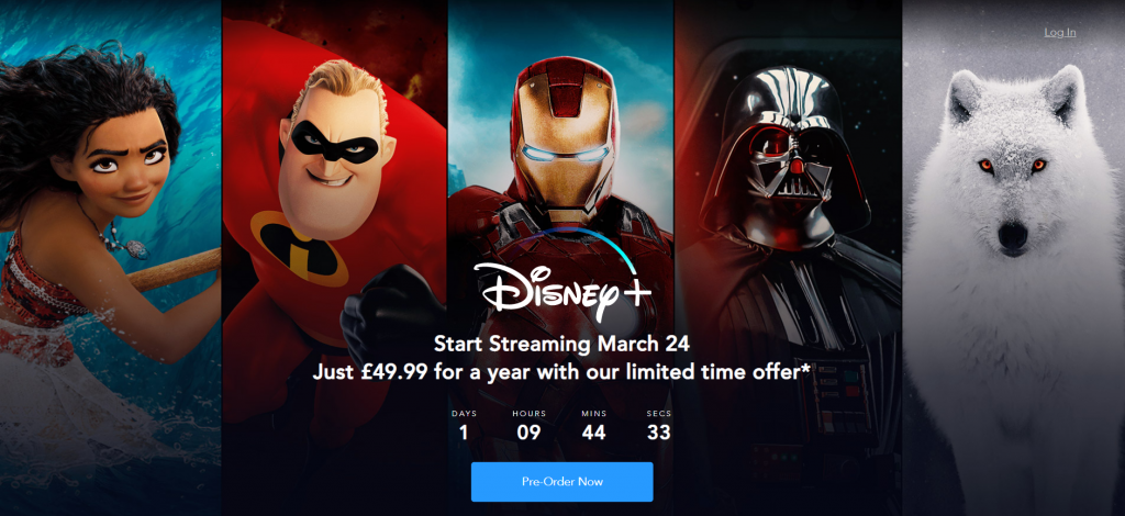
After clicking on the above advert, I came to the following landing page: This is an example of a click-through landing page, and a very effective one at that too, for the following reasons:
- Having the background be split into five columns, showing the five different areas Disney offer, is brilliant. It shows the true range of entertainment the company can offer, which makes it even more appealing to purchase.
- The main text on the page is a call to action, ‘Start Streaming…’ – this will encourage web users into converting.
- Having offers that are limited in time is an extremely effective way to up the conversion rate of a landing page. A count down timer is a great way to show this limited offer, which will only induce a sense of urgency to get the offer before it expires.
- The only button/link on the page to click is the click-through button, which will help prevent attention from going away from the button, increasing the CTR.
- Below the fold contains animations with scroll to help entice the web user further into subscribing, continuing off from the theme of the background image (five areas of Disney that can be explored).


