The last PPC campaign I analysed in the ‘Analyse A Real PPC Campaign’ series was from TopCashBack, who had, pretty much, a perfect search advert and a very good landing page too – TopCashBack had used an ad extension to provide web users more contextual links to click onto as well as increasingly the overall area the search advert took up (making it harder to ignore: especially with the fact it was ranked #1 too). With University and other school years just finishing, it is usually now that students and most people upgrade their laptops as it comes to the summer. Therefore, I thought it would be a good idea to see a PPC campaign for a laptop search phrase. Without further ado, here is a analysis of Dell’s PPC campaign.
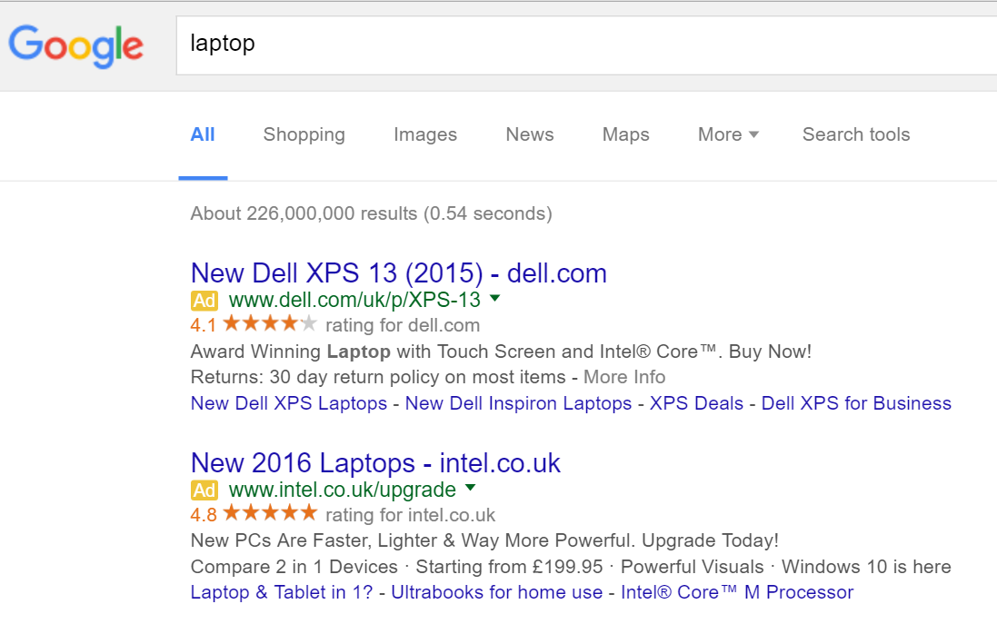
To view Dell’s PPC search advert, I had to type into Google search UK, ‘laptop’:
Looking at the advert itself, it has many good features associated with it:
- Dell included the URL to their homepage in the title which will encourage direct traffic.
- The advert is completely littered with ‘Dell’ everywhere to promote the brand.
- The use of ad extensions make the Dell XPS 13 seem both a highly rated laptop and a top of the range market-leading one too.
- The description is brilliant because it includes important information such that the laptop is ‘award winning’ – such a crucial fact really should have been included in the title though to grab more attention to the advert.
- Dell have used a call to action at the end of the description which will help to entice clicks onto the advert.
After clicking on the above advert, I came to the following landing page:
- The image and text which is cut off by the fold of the content is a brilliant move by Dell as it encourages the web user to scroll below the fold of the content to see the laptop and continue reading. Below the fold of the page contains more information to help sell the XPS laptop range.
- The red banner at the very top will no doubt grab the web user’s attention. A special offer will never go unmissed. However, Dell should not really be advertising this on an XPS page since the offer is referring to the Inspiron range. For this reason, Dell are paying money to promote their XPS range for it to be stolen by their Inspiron range? It would have been wiser to stick an XPS offer in the red banner instead.
- The top of the page seems very cluttered with unnecessary text, such as the navigation tree links just above the ‘XPS 13 Laptop’ title. This space could have been utilised better.
- At least the very top navigation menu expands to the whole range of Dell products so that if the web user was not interested in the XPS range, they are sure to find something else they would be interested in.


