The last PPC campaign I analysed in the ‘Analyse A Real PPC Campaign’ series was from Virgin Media, who had, on the whole, a well designed PPC campaign where the both the search advert and landing page had many benficial areas to gain a conversion or a click.
With summer 2017 approaching, it is that time of year when many people start buying plants to decorate their gardens with. Therefore, without further ado, here is an analysis looking into buying plants online, from Crocus.
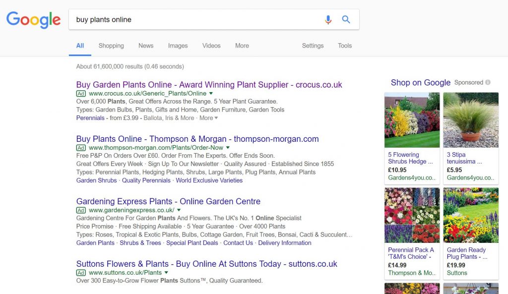
To view Crocus’ PPC search advert, I had to type into Google search UK, ‘buy plants online’: It is clear from being ranked for paid search results #1 that the cost per click (CPC) that Crocus have implemented for their campaign is very high, possible market leading. From doing so, the CTR that they are likely to get on their advert will be the highest of the four shown adverts.
However, web users suffer from ‘advertising block’, which is when a web user will scroll past adverts to reach the ‘real’ organic search results. These type of web users will see that Crocus, in fact, rank #2 organically for such a search phase, which is quite impressive. Saying this, it is understandable why Crocus have made a PPC campaign for such a search phrase:
- #2 organically is not as good as #1. Therefore, they could take traffic from the #1 organic spot which would be one of their main competitors in the industry.
- The competition for paid search results is fierce, with other competitors looking to steal traffic away from clicking onto organic search results. In order to prevent any drops in traffic, Crocus have had to create a campaign to ‘ward’ off competitors.
Looking at the advert itself, it is a well designed PPC search, mainly because of the structure of the title.
- Firstly, Crocus address what the web user searched for, which will attract their attention to reading the rest of the title.
- The next step of the title makes clear that Crocus are a respectable company to buy plants from, possibly the best.
- The last part of the title is the domain name of Crocus, which will naturally promote direct traffic as well as spread brand awareness of the domain name.
After clicking on the above advert, I came to the following landing page: The first thing that springs out from this landing page is the color and so it should. Being a landing page about selling plants, the colors used should reflect the colors of nature and the plants. This is achieved through using multiple images of flowers as well s the light theme color of green.
There are many good points to this landing page, listed below:
- There is a useful lead capture box to the left hand side which allows the web user to find exactly the type of plant they want to buy (for which, we can all assume, there are hundreds, if not thousands, of plants to choose from).
- This landing page could be deemed a click through page, from the main central image being a click through to a shopping experience to buy bedding plants with.
- Each image is associated with some sort of discount, providing more reason to the web user to shop with Crocus.


You must be logged in to post a commentLogin