The last PPC campaign I analysed in the ‘Analyse A Real PPC Campaign’ series was from EE, looking to promote their new 5G network. What we found was that both the search advert and the landing page were very well optimized – the search advert was packed full of keywords, whilst the landing page used an animation that showed the benefits of 5G. All in all, it done well to entice web users into using EE as a network provider for 5G, as well as increasing the overall brand awareness of EE.
One business that will seemingly never need promotion, since it dominates the market, is with Coca Cola. With this, here is an analysis of PPC campaign from the giants in soft drinks.
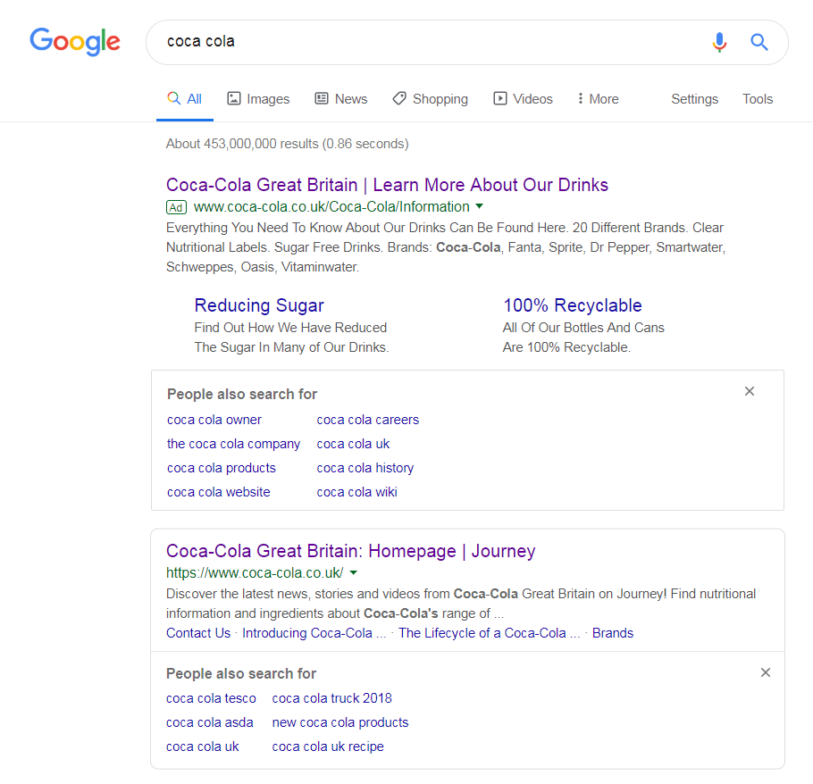
To view Coca Cola’s PPC search advert, I had to type into Google search UK, ‘coca cola’: Coca Cola have decided to bid for their own brand name, which is a tactic that is commonly done in PPC advertising, for one or more of the following reasons:
- To ward off competition – if you bid for your own brand name, the CPC of the brand name will naturally increase, making the financial incentive for competition to bid for it less appealing.
- To promote something new – the first result for a brand name is generally the homepage of a website, where it is difficult to promote something, such as a new product or service.
- To change the search engine conversion – maybe you do not want web users to visit your homepage, but to interact with your website through a different means, other than the homepage.
Looking at Coca Cola’s search advert, it appears that they are targeting the 3rd point of changing the search engine conversion – to enable the web user to learn more about Coca Cola and their drinks, instead of pointing them to a generic Coca Cola homepage. With this in mind, this is a great advert, particularly for the choice of site link extensions, adding to the ‘story’ behind Coca Cola becoming more healthy and environmentally-friendly.
After clicking on the above advert, I came to the following landing page:
- The landing page is packed with bright images – this helps to keep the web user’s attention, whilst making clear of the message Coca Cola want to convey.
- The information of Coca Cola is captured in a slideshow, so that it is easy for web users to digest the information quickly and clearly.
- The design of the landing page is not too colorful, except for the header – this helps to keep the attention focused on the center of the landing page.
- The navigation menu allows the web user to explore the other areas of Coca Cola’s website, aiding in maintaining a low bounce/exit rate for this page.


