The last PPC campaign I analysed in the ‘Analyse A Real PPC Campaign’ was from Shopify, who had both a good search advert and lead capture landing page, specifically designed with no other buttons on the page, so the only thing the web user could do was fill out the email address form (increasing the likelihood of a conversion).
One area that is always in demand is candles, to give off nice smells, ambiences and even add a bit of warmth to a room. With this, here is an analysis of a PPC campaign from Candles Direct.
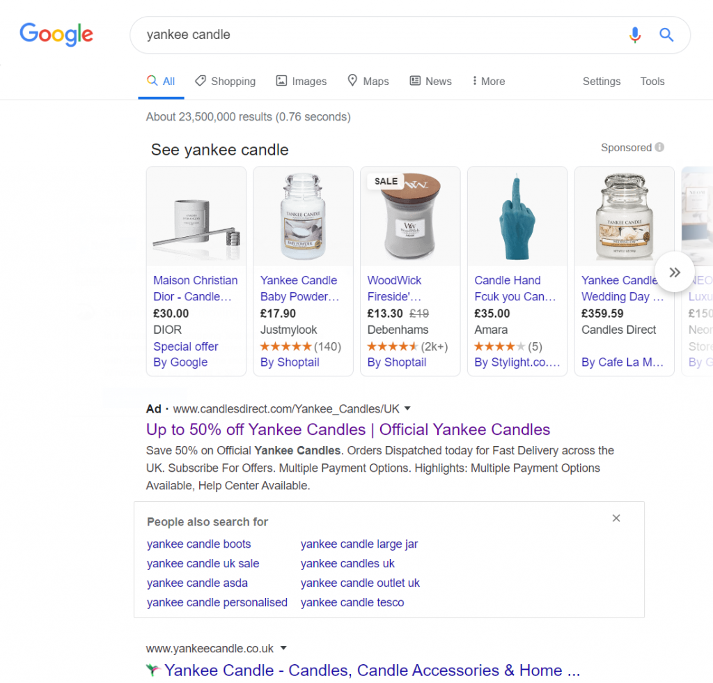
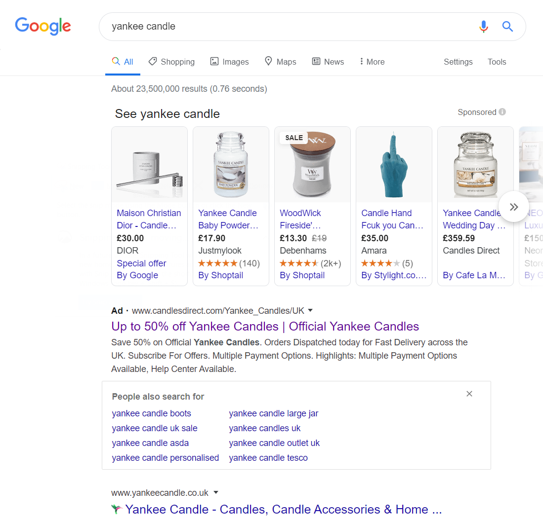
To view Candles Direct’s PPC search advert, I had to type into Google search UK, ‘Yankee Candle’:
- Shopping results are going to be very hard to compete against for this. Most people know roughly how much a Yankee candle is, so will look for the images to shop for the smell they want.
- There is a ‘People also search for…’ snippet appearing, which encourages web users to refine their search more specifically.
- Yankee candle, of course, rank number one for organic search results. For this reason, for Candles Direct to displace traffic away from Yankee candle, well, they are going to need to offer something a little special.
Looking at the advert itself, they fulfil the last bullet point completely with a quantifiable enticement: (up to) 50% off. This gives plenty of reason to click onto the advert since searching for a brand name suggests:
- The web user does not need to be convinced of the product – they are sold on it from searching the brand name.
- The last thing left, when it comes to deciding what to buy, is how much you are going to pay, which Candles Direct have addressed very well.
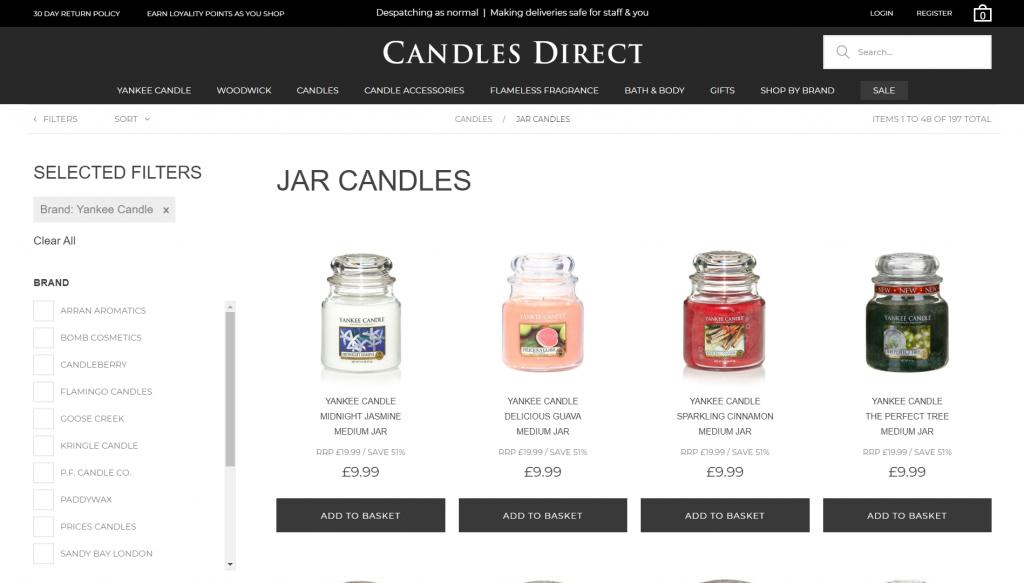
After clicking on the above advert, I came to the following landing page:
This is a good landing page to use in this situation, although the filters could have been improved to have ‘smell’ rather than ‘brand’, since we have already chosen the brand (being Yankee candle).
The ‘up to 50% off’ is also applicable on this page, which is important for PPC campaigns to do: have concurrent information from the search advert to the landing page. If the information between the search advert and landing page do not tie-up, the chances of an exit from the web user increase dramatically.
The only two pointers to improve for this landing page come with the general design and the styling of the discount. The theme is quite bland, and the color black is not something I would have associated as the main theme color of a candle store. As well as this, since so much emphasis was put on the discount, I would have expected the percentage savings per candle to be a bit larger in font, and more noticeable, possibly in a different color.


