The last PPC campaign I analysed in the ‘Analyse A Real PPC Campaign’ series was from Renault, who had, on the whole, a very good PPC campaign. The only criticism came with the landing page, which had become slightly outdated with the dates they had used for offers – this makes it clear that PPC campaigns are live and do need to be tweaked and modified so they are in keeping with the present moment.
One area of the internet that has lots of competition comes with muscle gaining drinks, such as protein powder for protein shakes. Looking at this sector, here is an analysis of a PPC campaign from Bulk Powders.
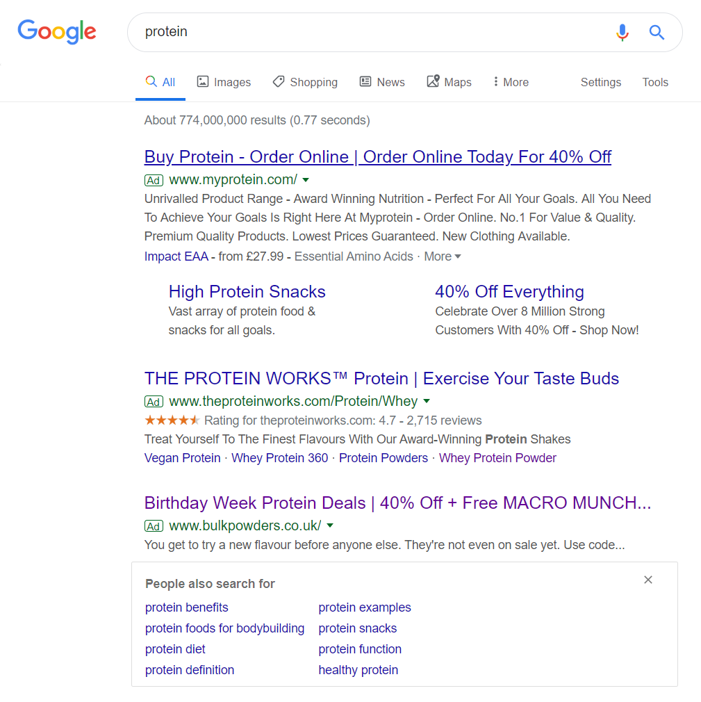
To view Bulk Powder’s PPC search advert I had to type into PPC search UK ‘protein’: Although a competitive keyword search phrase, only three adverts appear out of the maximum of four adverts. This could be down to the ‘People also search for’ snippet, which would naturally push the fourth advert below the fold of the page.
Bulk Powders are going to struggle against the competition, mainly because the other two adverts use ad extensions to help differentiate the advert. The Protein Works use the ad extensions, to make clear that their customers love their product, whilst My Protein use the site link extension to increase the spacial size of the advert, as well as increasing the number of links the web user can click onto.
With this in mind, Bulk Powders tactics in PPC is to use a promotional code to attract web users, although My Protein has the same, with the same value discount code. If Bulk Powders really wants to differentiate in this competition, they either need an ad extension or to increase the discount code value they are offering web users.
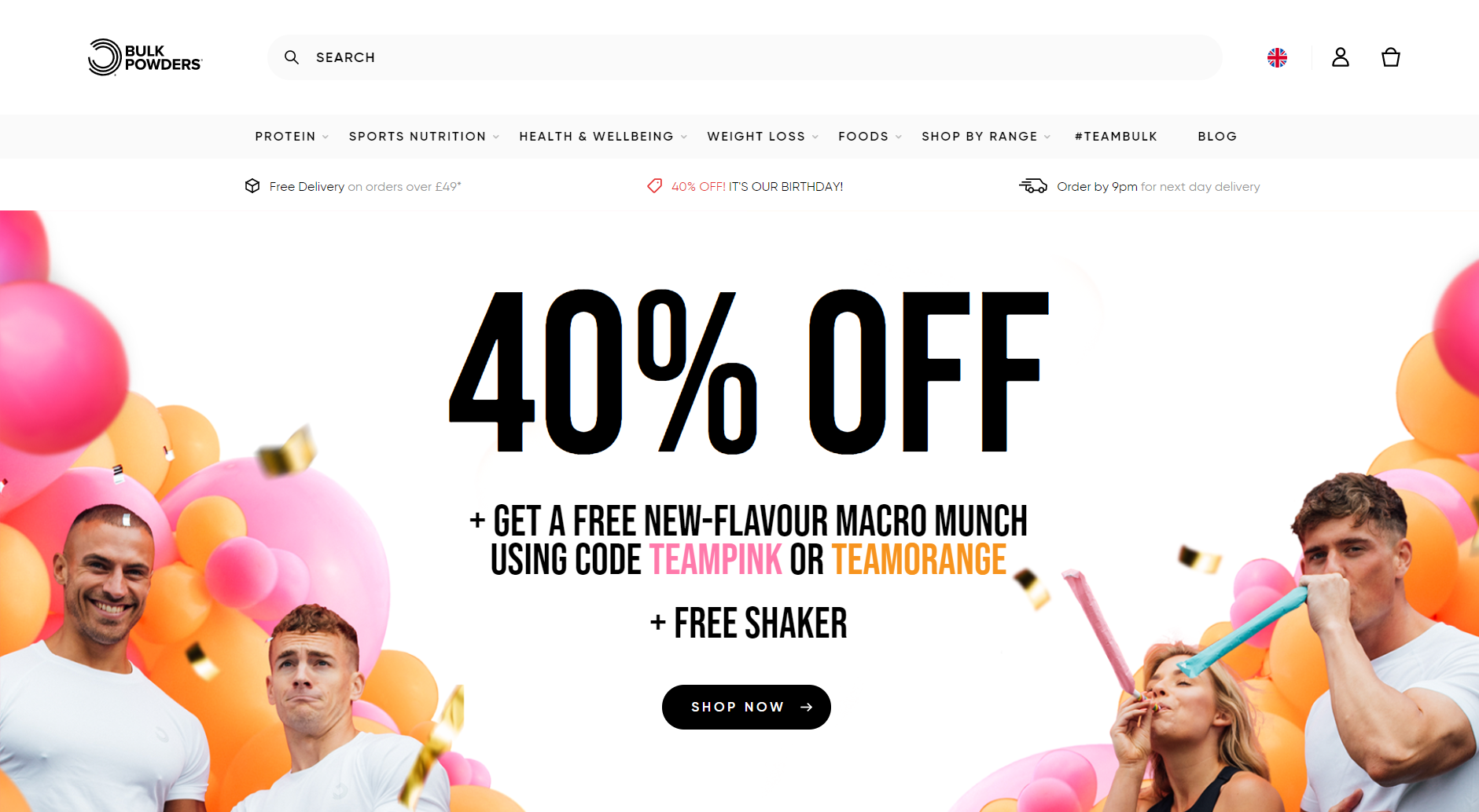
After clicking on the above advert, I came to the following landing page: This is a great example of a click through landing page for the following reasons:
- With click through landing pages, it needs to be crystal clear what the button is to click onto. This is clear on this landing page, since there is a ‘SHOP NOW’ button in black, which is the only linked button above the fold, apart from the navigation menu.
- The navigation menu expands when hovering over the options, allowing lots of content and links to be displayed in a efficiently spaced menu bar.
- The enticement to shop with Bulk Powders is made clear in the central area of the landing page, in a large font – this makes it almost impossible for the web user to miss the offer.
- The image used is of fit men and women in a colourful and fun background – this helps to promote the product as something that will improve your life, both physically and, potentially, mentally too.


