The last PPC campaign I analysed in the ‘Analyse A Real PPC Campaign’ series was from Virgin Experience, who had a well-timed PPC campaign to take advantage of consumers looking to buy gifts for family and friends but left it too late to have items dispatched, posted and delivered in time for Christmas. For this reason, it turned out to be a very good PPC campaign that would have profited hugely from the desperation of consumers wanting gifts (where Virgin Experience would provide the gift as an e-gift).
Mobile sim providers tend to offer a lot of incentives after the holiday season to get consumers, both new and existing, to sign up to new sim contracts. Looking at this sector, here is an analysis of a PPC campaign from BT for their mobile sub-division.
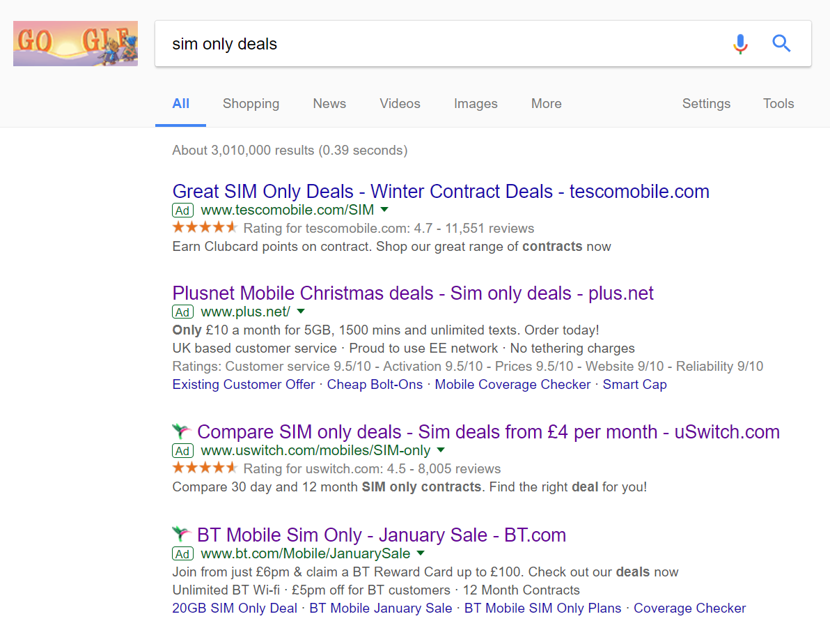
To view BT’s PPC search advert, I had to type into Google search UK, ‘sim only deals’:
Putting this aside, there are some good points to BT’s advert:
- The title is well designed, including the search phrase, the brand name of BT, the fact there is a sale as well as the domain name at the end, to attract direct traffic.
- The description starts with a call to action which will work to entice the web user into clicking onto the advert. The first line consists of two call to actions, whilst the bottom line consists of three reasons to join BT mobile (using the rule of three persuasion technique). Both use lots of numbers to illustrate the January sale at BT mobile.
- The site links ad extension is used to provide the web user some useful links they might be interested in clicking on. This would work to increase the CTR of the advert, as a whole, compared to if the site links extension was not used.
After clicking on the above advert, I came to the following landing page:
- The color scheme is a bit bland. I understand the purple reflects the brand color of BT. However, with the search advert being all about a January sale, I am surprised there is a lack of red on this page, to inflict a sense of urgency of a sale with BT mobile’s sim deals.
- The navigation menu is extremely complex, which, to some extent, is good, since it does mean the web user can explore BT’s website as a whole. However, the web user did not land onto this landing page to click onto broadband deals, BT Sport or BT TV. They clicked for BT Mobile. Therefore, I feel the navigation menu could be simplified a bit.
- There is no mention of any sim deals above the fold of the page, which would be enough for some web users to exit the page straight away. The landing page needs to provide the web user more information about sim only deals above the landing page to make sure they are enticed enough to explore the rest of the page, below the fold.


