The last PPC campaign I analysed in the ‘Analyse A Real PPC Campaign’ series was from DWM Mortgages. The search advert had some good elements to it. However, there was no call to action to encourage the web user into a click. On top of this, the landing page was not very well designed, with a poor picture to highlight the joys of getting a first home.
Electronics are generally looked at to buy online. With this, here is an analysis of a PPC campaign from the giant themselves: Amazon.
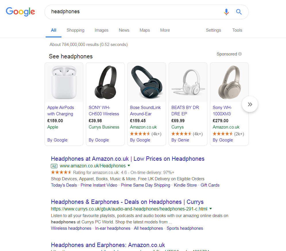
To view Amazon’s search advert, I had to type into Google search UK, ‘headphones’:
- Return on investment (ROI) – If Amazon is making money from this campaign, then it makes sense to continually run it.
- Competition – It is clear that Amazon could be doing this because they rank organically second for the search term against Currys. When this is the case, in order to ‘leap frog’ Currys, they would either have to improve their organic ranking or pay for a PPC campaign to run.
- Amazon is a website which wants the web user to spend as much time on it. Even if the web user was not interested in headphones, there is a possibility the web user could buy others things on Amazon, improving the profitability of the campaign.
Looking at the advert itself, it is a very ‘standard’ Amazon advert. This is to make clear to the web user that they know exactly what to expect from clicking onto the advert (other search adverts of Amazon will be very similar in style and structure). The addition of the ratings help to make Amazon look a good place to shop, whilst the site link extensions will work to provide more areas of the advert to click, increasing the CTR.
After clicking on the above advert, I came to the following landing page:
- There are many links the web user can click onto, if they are not happy with the page they landed onto
- The search bar will allow the web user to search for whatever product they want on Amazon (which could literally be anything)
- The website design is recognizable to the majority of web users, so there is no need to change it
- The page Amazon have used as a landing page is of a list of headphones you can buy, encouraging the web user to scroll down to see what other types of headphones they can buy and at what prices


