The last PPC campaign I analysed in the ‘Analyse A Real PPC Campaign’ series was from wpengine, who had a good search advert and a great landing page, especially due to the fact that had the option of live chat to a human within seconds of landing onto the web page.
With it being the middle of summer, something that will be on many people’s minds, if they don’t have access to it already, is feeling cooler! Therefore, without further ado, here is an analysis of a PPC campaign from airconco, who sell air conditioning units.
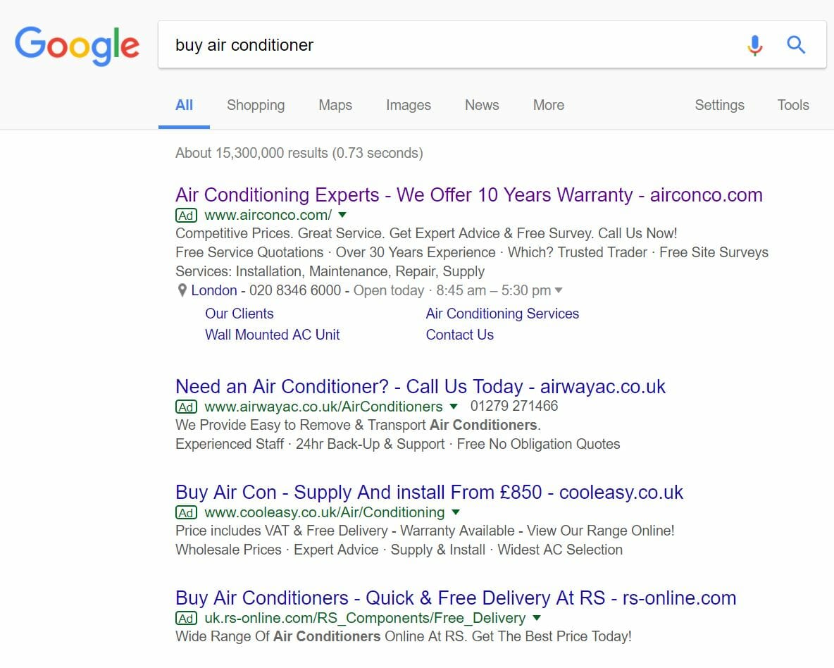
To view airconco’s PPC search advert, I had to type into Google search UK, ‘buy air conditioner’:
The search advert clarifies this through:
- Mentioning the 10 year warranty in the title.
- Mentioning the keyword and ‘Experts’ in the title.
- Including that they are a Which? trusted trader in the description.
The addition of the site links extension and call extension all add to helping to get a click onto this advert. As well as this, it also pushes the competition’s adverts further down, increasing the exposure of airconco’s advert by differentiating it easily to the rest. So, on the whole, this is a good search advert.
After clicking onto the above advert, I came to the following landing page:
The structure of the landing page is also a little different from the norm that web users would be use to. For example, the top left is usually where the brand name and logo is. However, airconco have stuck it in the middle. This also splits up the navigation menu, but, at the minimum, does provide some pleasing looks in terms of making the webpage look symmetrical.
The colour chosen on the landing page is good, being blue, since this is a colour associated with water and being cool.
Moving onto the actual content, it is a little confusing what this landing page is – if the conversion is to get the web user to call, then I am not totally sure this would have been the best way to gain conversions (possibly a contact page or lead capture page would have been better, with live chat). The actual content is a little bland and generic, along with a title in capitals that does not really add anything to getting a conversion. Therefore, on the whole, there are a lot of places this landing page could have been improved.


