The last PPC campaign I analysed in the ‘Analyse A Real PPC Campaign’ series was from Piaget, who had a well designed search advert, and had chosen to use a standard page from their website as their landing page. As much as this can be a bad idea, it can also work to an advertiser’s advantage if the standard page is well optimised, which is the case with Piaget.
One of the most expensive areas to bid on in PPC comes with insurance, particularly the likes of car and home insurance. Looking into this sector, here is an analysis of a PPC campaign from HomeProtect.
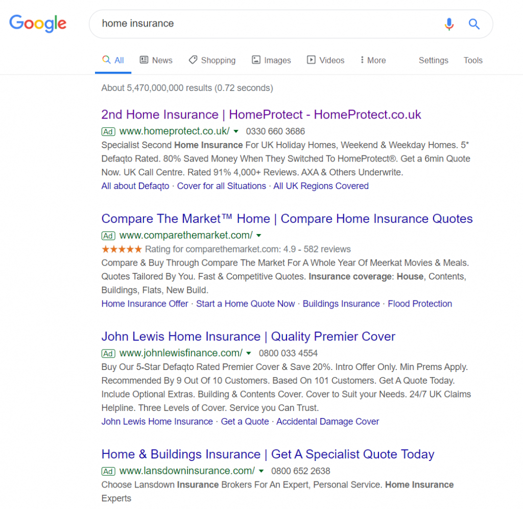
To view HomeProtect’s PPC search advert, I had to type into Google search UK, ‘home insurance’:
Looking at the advert itself, there is one main issue affecting this search advert: contextuality and a lack of specific targeting.
The vast majority of people searching for ‘home insurance’ will be looking for home insurance for their only home – not many people have a second home. Considering the CPC that would come from bidding for ‘home insurance’, HomeProtect will be paying out a lot of money for traffic that are not ideally specific for their PPC landing page: second home insurance cover.
In this situation, it would have been better to not bid for vague keyword search phrases, since this can cost money money and bring in less contextual traffic.
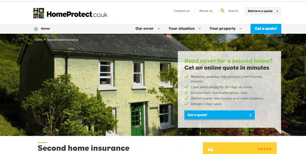
After clicking on the above advert, I came to the following landing page:
- It is a great idea to have a background image of a house, signifying what HomeProtect are there to ‘protect’.
- HomeProtect have added an extremely well-optimised box on the right hand size, illustrating:
- A call to action, to entice the web user to convert (click onto the ‘Get a quote!’).
- 5 reasons to shop with HomeProtect, to add further enticement.
- The conversion ‘button’, in a bright and different colour to help it stand out on the landing page.
- The navigation menu expands upon hovering, which helps the web user navigate to the majority of the whole website – the more accessible a website is (in as few clicks as possible), the greater the liklihood of a call to action.
- The only negative to this page comes below the fold, where there is an ‘essay-amount’ of traffic explaining in detail why to go with HomeProtect. For a landing page, the amount of content needs to be limited, until the liklihood of a conversion (sale) is much higher.


