The last PPC campaign I analysed in the ‘Analyse A Real PPC Campaign’ series was from My New Smart Watch, who had a un-insprising PPC search advert, accompanied by a landing page that had a few areas of improvements.
One area that is always going to be of the utmost importance to people is counselling. Mental health is something that we often overlook, but is of extreme importance to our state of well being. With this, here is an analysis of a PPC campaign from Better Help.
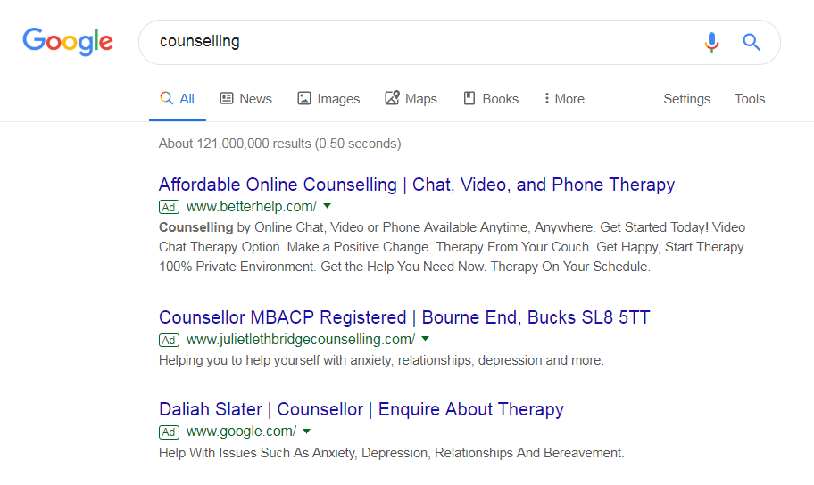
To view Better Help’s PPC search advert, I had to type into Google search UK, ‘counselling’:
It’s good that Better Help have ranked #1 for this paid search. This suggests that they have a high quality score, either from a relevant search advert (which they have), and/or a high CPC.
Looking at the advert itself, it is very appealing for the following reasons:
- It makes clear the counselling can be done in many different ways for convenience: text, call, video etc.
- Using the word ‘affordable’ is extremely important, considering some counselling can be very expensive.
- The description is littered with lots of information, enabling people to either:
- Click based on the title
- Or read the description to learn more, and then click onto the advert
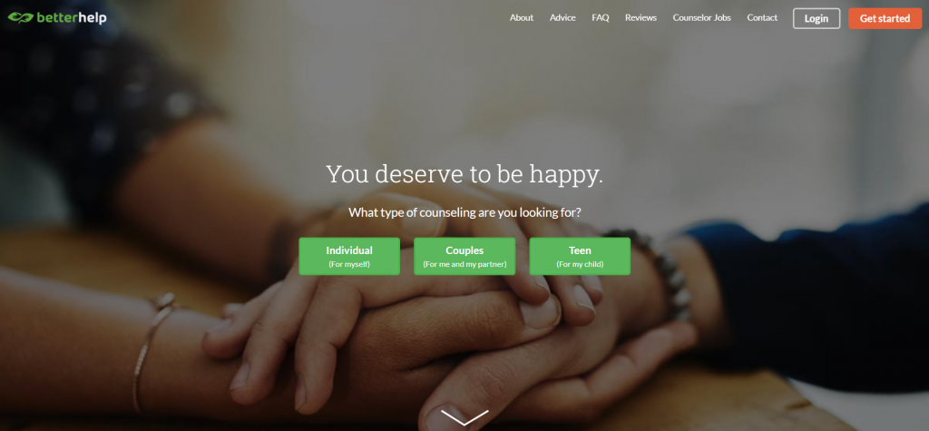
After clicking on the above advert, I came to the following landing page:
- The main background image is of a compassionate image of holding hands, illustrating support and care, which is what counselling is there for.
- The largest font used makes clear it should be read first – it’s nice and reassuring this is a self-affirmation of being happy.
- Better Help need to understand who the counselling is for. By using different background button links make it easy for the web user to spot them and click onto whichever one is applicable to them.
- There is an arrow pointing down at the bottom of the page. This makes it clear that there is content below the fold of the page. Such information is there to help the web user understand what Better Help can offer them, as counselling is a very personal choice. There is nothing that implies making money on this page, but helping people: the way it should be for a PPC campaign on counselling.


