The last PPC campaign I analysed in the ‘Analyse A Real PPC Campaign’ series was from Bose, who had generally a good search advert and a well designed landing page, aimed at showing the products they have to offer in a manner that goes with the Bose brand.
One area of interest that is going to gather lots of traffic is with phone cases and phone skins. Therefore, without further ado, here is an analysis of a PPC campaign from EasySkinz.
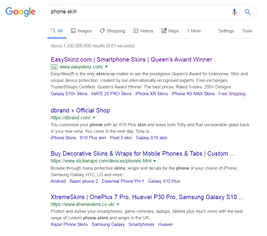
To view EasySkinz PPC search advert, I had to type into Google search UK, ‘phone skin’:
Looking at the advert itself, they have made a title that is brand focused, keyword focused and then confidence inspiring – the award that EasySkinz have won is a clear element that differentiates them to the competition, hence why it is used as a unique selling point to compete better with the top organic search results. This, ultimately, will gain EasySkinz more exposure and a higher CTR (which is also helped by going into some more detail of the award in the description).
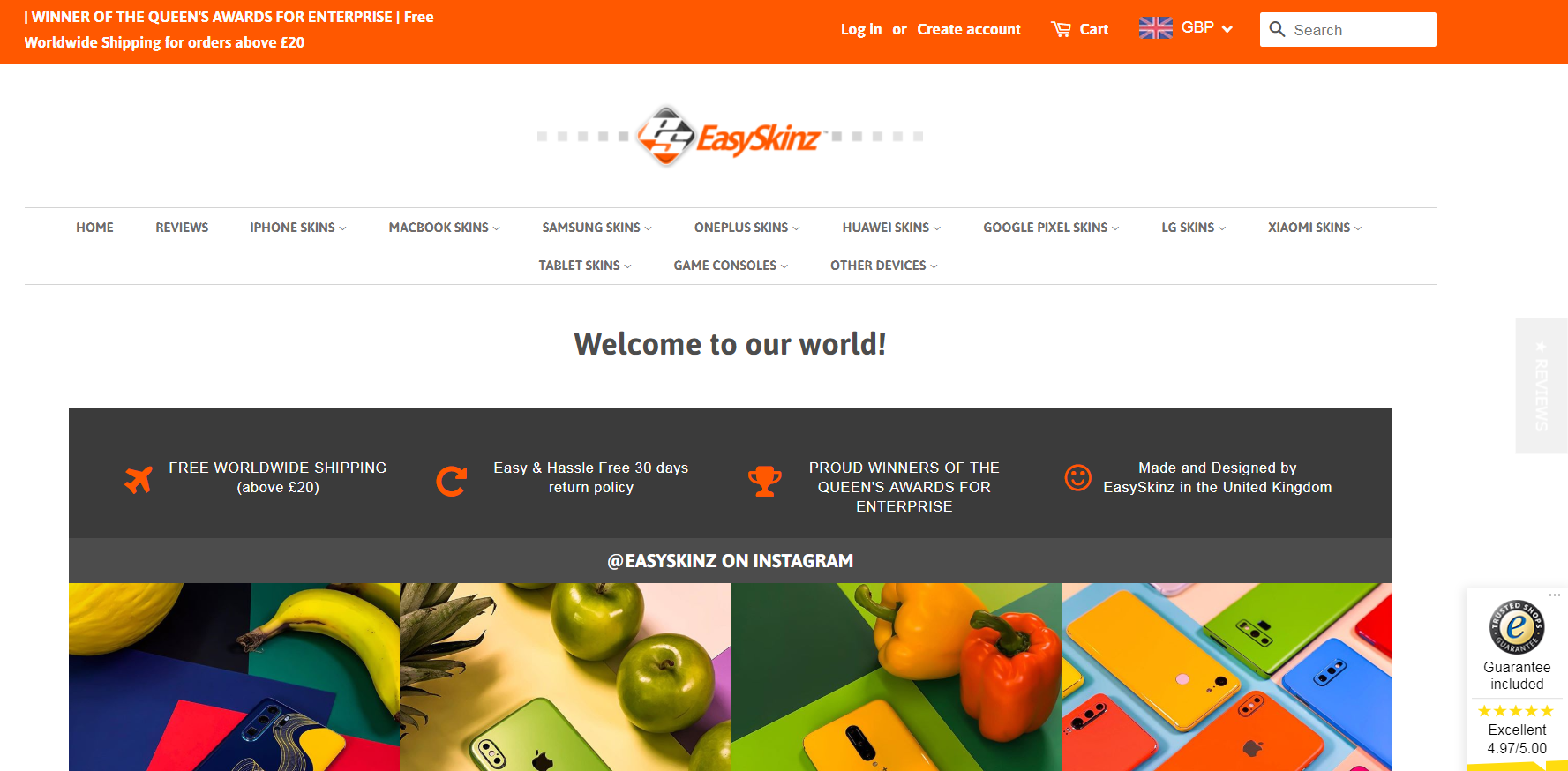
After clicking on the above advert, I came to the following landing page:
- The central location to the landing page states ‘Welcome to our world’. This is a bit of wasted space, which could have been better utilized showing of the products.
- The area below this includes more reasons to shop with EasySkinz. The search advert did this effectively, so there is less reason to put it as a priority to still convince web users to converting on the landing page – most web users would be expecting to see some sort of skins they could buy after clicking onto the advert.
- The general design/theme of the page is a bit bland and not colorful, which does not evoke the right image when it comes to offering a range of different color skins etc.
- The most important thing that should be on this landing page is an image/shopping results page that clearly illustrates the types of skins EasySkinz offer. The fact we are none of the wiser what actually EasySkinz offer makes clear that this landing page is not as effective as it could be.


