The last PPC campaign I analysed in the ‘Analyse A Real PPC Campaign’ series was from The Tea and Biscuit Club, who had a pretty poor PPC campaign on the whole. The search advert was not ranking high in paid search results and lacked key qualities to a successful search advert. Moving to the landing page, this was a broken link, resulting in all the paid traffic going to waste.
A technology that is coming to place now, with much excitement, is 5G: with the plan to dramatically improve internet speeds for mobile devices. Looking into this, here is an analysis of a PPC campaign from EE.
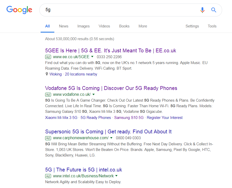
To view EE’s PPC search advert, I had to type into Google search UK, ‘5g’:
EE have done well to achieve the top spot of paid search results, beating their main competitor Vodafone. Looking at the advert itself, it is packed full of important keywords, such as ‘5G’, ‘EE’, ‘best network provider’ and so on. This solidifies EE as a very good network provider, especially if they are at the top of paid search results, first with 5G, best network provider and comes with extra benefits. It really gives little reason for web users to not click onto the advert.
After clicking onto the above advert, I came to the following landing page:
- The color scheme used is inline with EE’s brand, making the landing page very visually appealing to the web user.
- The central and most important of the landing page contains content relating to 5G (‘Discover 5G’). This is accompanied by an animation background highlighting the benefits and areas of 5G readily available, helping to make the next generation of network connectivity seem even better.
- The navigation menu does not take up much space at the top. It is very well designed, since it expands upon hovering, allowing the web user to visit any page on EE’s website.
- It is clear this is a click through landing page from the yellow ‘Read now’ button. EE wants the web user to learn more about how amazing 5G is. What’s great about this landing page is that if the web user does not choose to click on the button, but scrolls down, they still receive lots of visually appealing information about 5G. This means, no matter what the web user does, be it a click or scroll, they are still converting for EE in learning about their next generation mobile connectivity.


