The last PPC campaign I analysed in the ‘Analyse A Real PPC Campaign’ series was from Book Bride, that had, on the whole, a very good PPC campaign. The main criticism was the fact the click through landing page linked to a poor lead capture page, neglecting the efforts of designing a responsive and clean PPC landing page (as the conversion will fall short at the page after the click through page).
With summer around the corner, a sport/hobby that will pick up in popularity will be sky diving. Looking into this sector, here is an analysis of a PPC campaign from GoSkyDive.
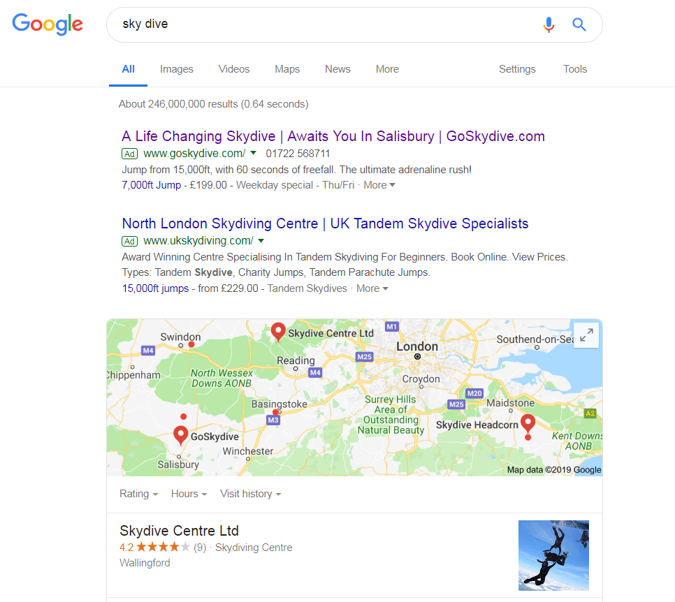
To view GoSkyDive’s PPC search advert, I had to type into Google search UK, ‘sky dive’:
Regardless of this, GoSkyDive have the highest quality score, hence why they rank first. This is mainly influenced by the CPC they adopt, making clear that they would be paying more per click than UK Sky Diving below them.
It is clear that GoSkyDive are using location targeting along with keyword targeting. The location of the center is closest to the location the Google search was searched from, making it very appealing with a call to action in the title and description.
Interesting, both adverts use the same ad extension to display a price with the feet to jump from. The problem with this is that it makes GoSkyDive look less value for money than UK Sky Diving, for the fact that you can jump over twice the height for just £30 extra. In this situation, it would have been better to not compete financially in PPC for GoSkyDive.
After clicking on the above advert, I came to the following landing page:
- The theme is clean and responsive in its functionality. it doesn’t have too much content on it, encouraging the web user to stay on and explore GoSkyDive and what they offer.
- The main area (that appears an image) is a video of people sky diving, helping to promote an adrenaline rush from just browsing the website. GoSkyDive want the web user to get excited about sky diving from visiting their website.
- The click through buttons are both contrasting in color as blue. This makes it easy to see them and easy to click onto them, especially when the number of links on the page is limited.
- Below the fold of the page shows the options of sky diving that GoSkyDive offer, in a visually pleasing manner. This will help web users determine what they want to do with GoSkyDive and gain them a conversion.


