The last PPC campaign I analysed in the ‘Analyse A Real PPC Campaign’ series was from Love Holidays, who had both a very well designed search advert and PPC landing page. This was from using an ad extension, whilst addressing cheap holidays to the web user in the search advert, and from adopting a ‘sea’ blue theme for the landing page, with lead captures to help the web user find the right holiday for them.
One occasion that will always be in demand is with weddings. Look at those wanting to plan a wedding, here is an analysis of a PPC campaign from Book Bride.
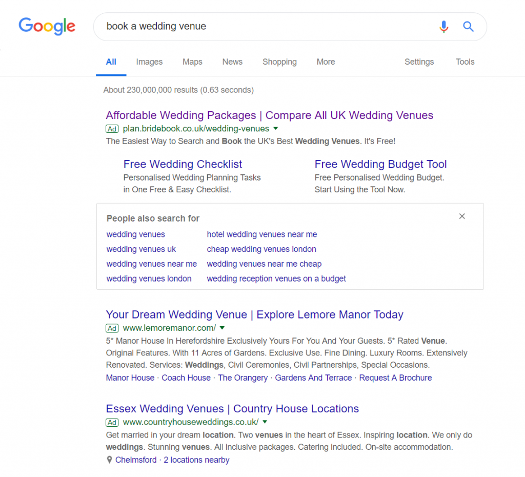
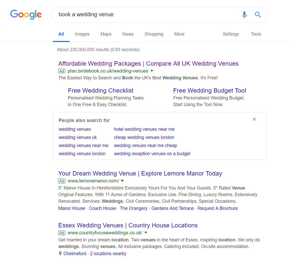
To view Book Bride’s PPC search advert, I had to type into Google search UK, ‘book a wedding venue’:
Look at Book Bride’s search advert, it is clear that this is a ‘middle man’ website aimed at those wanting to compare wedding venues to book. This will be an attractive proposition to people, since it shows them a range of venues they could have, instead of just one (which is what most of the competing adverts do instead). The site link extension is a good addition too, allowing the web user to take some sort of value from the landing page, even if they choose to not book anything with Book Bride.
After clicking on the above advert, I came to the following landing page:
- The page itself is very clean, easy on the eye and responsive. This makes scrolling down the page, seeing content animate in and out, very easy to digest.
- However, once scrolled below the fold of the page, the ‘Find your venue’ button is not fixed (disappears after scrolling below the fold). Therefore, the conversion for this landing page is dependent on what part of the landing page the web user is viewing. It would have been better to always make it possible for the web user to click onto the button, no matter what point they have scrolled to.
- The click through page the button links to is this. The problem with this is that the design and theme of the main website is everything but what was described for the landing page: clean, easy on the eye and responsive. It is very important to have a consistency in the theme and to not lure the web user in with a nice landing page only – the exit/bounce rate of the follow up page should illustrate this.


