The last PPC campaign I analysed in the ‘Analyse A Real PPC Campaign’ series was from Samsung, looking to promote their new flagship phone: the S10. However, what was found was that the landing page for the S10 was not appealing at all, and lacked any information about the features of the smartphone above the fold of the page. Instead, Samsung focused on the cost of the new flagship phone, which would put many people off purchasing it, especially since they see the price first before the ‘must have’ features.
An area that is always in high demand is with loans, such as for cars. With this, here is an analysis of Light Finance.
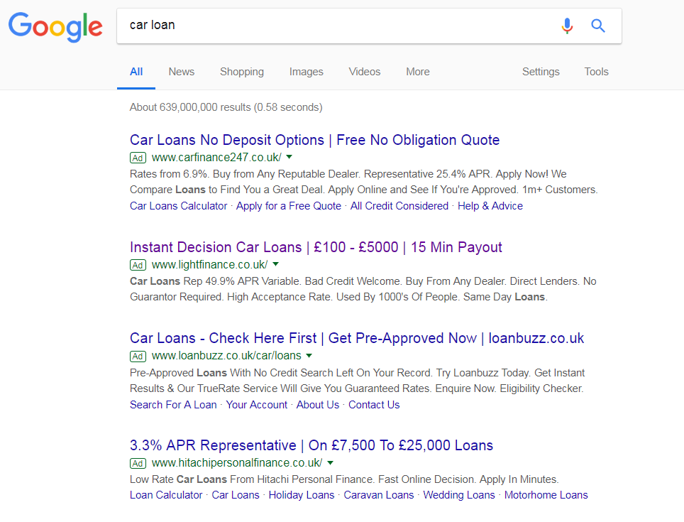
To view Light Finance’s PPC search advert, I had to type into Google search UK, ‘car loan’:

The maximum of four adverts appear for this search phrase, and not surprisingly either – a car loan has the potential to make companies hundreds and hundreds per conversion. Therefore, PPC is a good way to go, especially since getting ranked organically, especially as a new business (such as Light Finance, which is relatively new compared to most lenders) is very difficult.
Looking at the advert itself, Light Finance have been very good with their use of the title. Power words such as ‘Instant’ makes the web user more inclined to try them if they can get ‘instant’ results. They mention the loan range and how long it will take to be paid – all information the web user wants to know. However, the description, I feel, is a little let down by illustrating what APR variable Light Finance offer web users. When compared directly against the competition, this is a rather high APR. This brings the point forward that you should only ever display quantitative information on the search advert if it works to your favor to make you advert come across more appealing: especially against the competition.
After clicking on the above advert, I came to the following landing page:
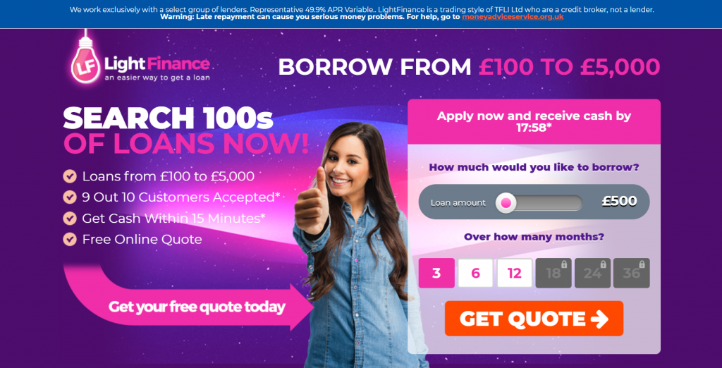
As a landing page goes, this is very colorful! It is a good example of a how a landing page, such as a lead capture/click through landing page should be for the following pointers:
- The web user cannot scroll below the fold, keeping them facing the form to fill in.
- The colors are bright, keeping the web user’s attention.
- There are a lot of call to actions on this landing page, helping to direct the web user into a conversion.
- The ‘GET QUOTE –>’ button moves a little, helping to make it stand out from everything else on the landing page – animations are very good way to grab the web user’s attention on landing pages.
- There is a list to the left highlighting the reasons to use Light Finance for loans.
- The form that is required for the web user to fill in is extremely easy. There is a lack of keyboard input (only mouse input), making the web user’s life even more easier.

