The last PPC campaign I analysed in the ‘Analyse A Real PPC Campaign’ series was from Prestige Hampers, who had a well designed search advert and landing page, considering that the ranking they achieved in paid search results was last at 4th place.
With Samsung releasing the new S10 flagship smartphone, now has never been a better time for Samsung to use PPC to market their new phone and spread brand awareness for it. With this, here is an analysis of a PPC campaign from Samsung, promoting the new S10.
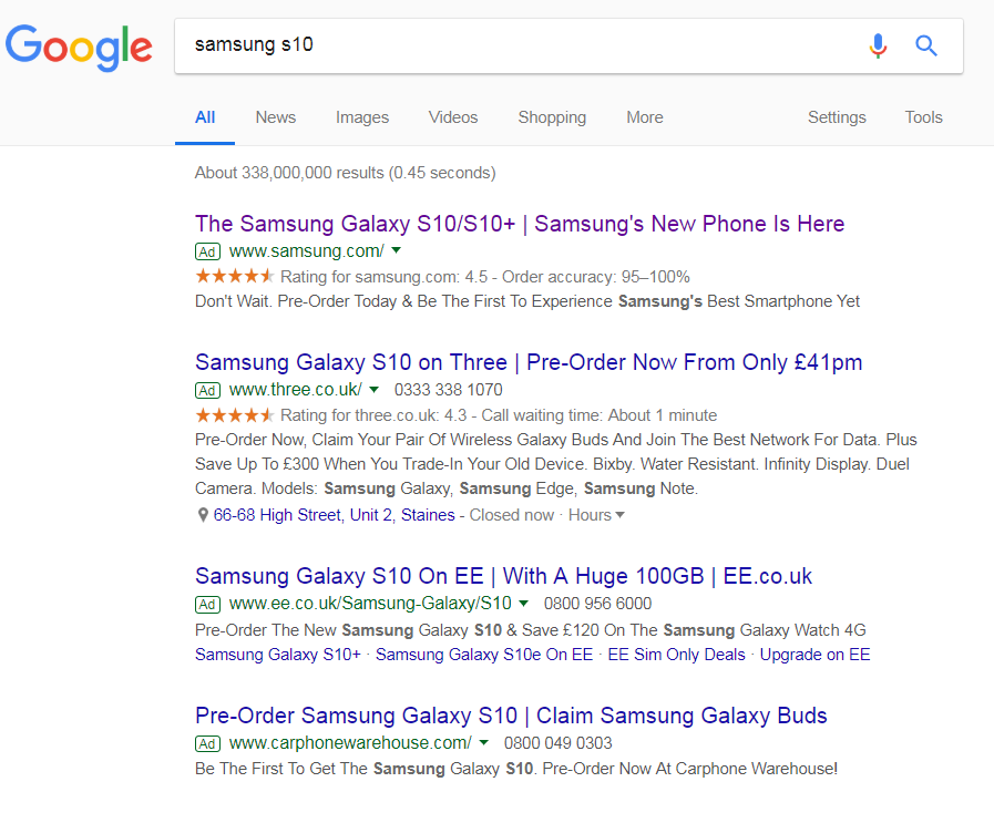
To view Samsung’s PPC search advert, I had to type into Google search UK, ‘samsung 10’:
The competition for this search phrase is fierce, simply because it is a new phone and all of the carriers want people to buy the new phone with their own data plans (as this is where the carriers make the most of their money).
It is, for this reason, a good idea for Samsung to get the top spot of paid search results. The profit margin they will achieve from selling direct will be greatest if they sold without a third party ‘middle man’ carrier. As well as this, Samsung wants to promote the S10 first before anyone else – there are incentives to get top spot.
As a whole, the advert is very bleak, which is a good idea to do for a new product. This encourages the web user to click onto the advert, in order to find out information about the new phone. If Samsung provided too much information or specs in the search advert, it may put people off clicking onto the advert.
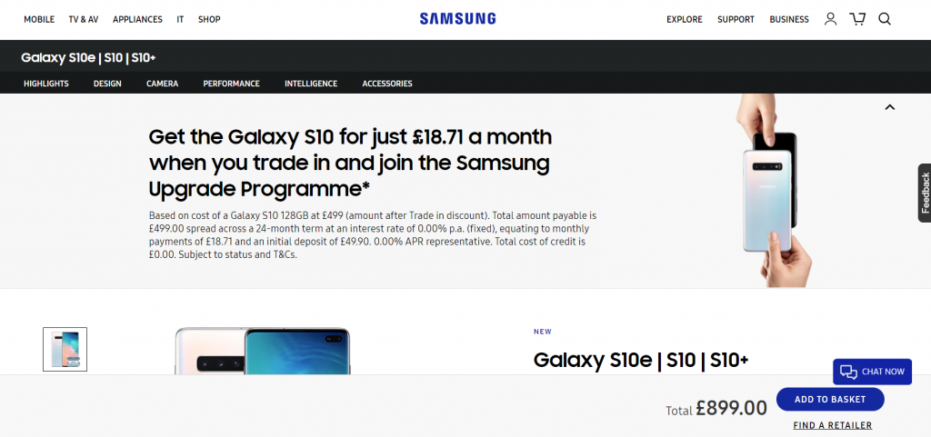
After clicking on the above advert, I came to the following landing page:

As a landing page goes, I am not totally convinced this is the best one for a new product launch, such as Samsung’s S10. The following points stand out most:
- Samsung mention the price floating (so that it is always present to the web user, no matter how much they scroll). As much as this is a good idea so it enables the web user to buy the phone no matter what part of the landing page they are on, it also illustrates just how expensive the phone is. Before showing the price, it would have been a good idea to entice the web user with the features of the phone, so that they wanted to buy the phone before actually seeing the price.
- There is no clear picture of the new smartphone, which is the central reason why the web user clicked onto the search advert. The web user should be ‘wowed’ by an image of the smartphone, showing off how good it looks or some of its new features.
- The central area of the landing page is full of content about pay monthly installments for those looking to pay monthly for the S10. As much as Samsung would like people to join their monthly program, it does not show off the phone, which is what this landing page should be about.


