The last PPC campaign I analysed in the ‘Analyse A Real PPC Campaign’ series was from NHS, who had created a PPC campaign to target those looking to eat healthy, by redirecting search engine traffic from visiting the organic first result of NHS to a different page through their PPC campaign. Changing the top organic result is a tough call, hence why many companies use PPC to redirect traffic to the relevant page they want.
An area that is fiercely competitive on the internet is the car loan market, especially since a conversion has the potential to make companies a lot of money. With this, here is an analysis of a PPC campaign from Car Money.
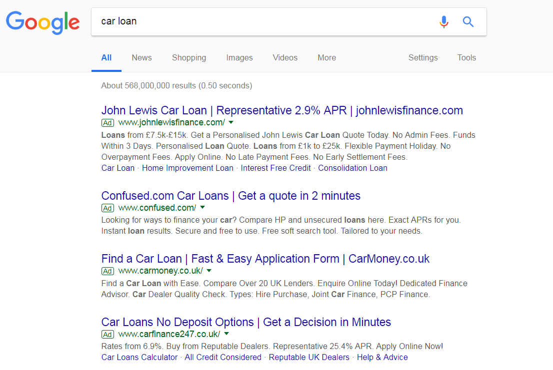
To view Car Money’s PPC search advert, I had to type into Google search UK, ‘car loan’:
However, there are a few ways Car Money have made their advert more attractive to click on. This includes:
- Starting the title with a call to action, to evoke an action from the web user to ‘Find a Car Loan’
- Include a call to action at the start of the description
- Include the domain name/brand name of Car Money in the title
It could have worked to their advantage to use an ad extension too, since this will differentiate Car Money’s advert to the competitors (since none of the competitors use any ad extensions, except the top with the ‘less so’ obtrusive site link extension).
After clicking on the above advert, I came to the following landing page:
- The brand logo is clearly displayed in the top left, as well as with an animation of a nodding ninja in the middle – this solidifies the brand image of Car Money to the web user.
- Although the color scheme might not be to everyone’s liking, it is simple and purposely not bright – this is so that the form is the brightest area of the landing page, so the web user’s attention is attracted to the area first.
- The form is very easy to use, preventing minimal reasons for web users to not fill it in. This makes this landing page a very good form of lead capture page.
- The content on the landing page is all geared to providing the web users reasons to get a car loan with Car Money. They have achieved this with bullet points to the left, 5 star customer rating in the top right and a statistic in the bottom left of how many loans had been approved for the year.


